What's new
Photoshop Gurus Forum

Welcome to Photoshop Gurus forum. Register a free account today to become a member! It's completely free. Once signed in, you'll enjoy an ad-free experience and be able to participate on this site by adding your own topics and posts, as well as connect with other members through your own private inbox!

How do I remove green tint?


Thor Thorsson

New Member
Messages
3
Likes
4
Hi! When I edited this photo in Lightroom and Photoshop I got a green tint in the center clouds and the upper sails of the ship. Could someone please help me remove the green tint. I want the same yellowish grayish tint all over the image.

Here is the area with the green tint I want to remove:
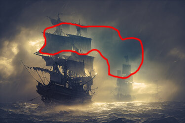
Ships in storm - area to edit.jpg

The full resolution image to edit is attached
 

Attachments

  • Ships in storm 2500 x1667.psd
    23.9 MB · Views: 8

Thor Thorsson

New Member
Messages
3
Likes
4
Thanks Babine! I appreciate your help.

My original image has a green tint all over the image. But in the marked area the green tint is more prominent. Before posting here I tried to remove the green tint in Photoshop with the curves adjustment layer. I tried to adjust the green and red channels. But I got a to much overall tint change of the whole image. And the prominent green tint in the marked area where still to green.

As I understand your edit with the Photoshop curves adjustment layer is an overall adjustment of the whole image, But the image has become to reddish brownish to my taste.

Is it possible to do a local tint adjustment of the marked area? I don't have the skills to to such a local adjustment in Photoshop. After getting rid of the prominent green tint in the marked area it would be possible to make a minor overall tint adjustment to get rid of the slight green tint of the whole image.

The image is intended to fit color-wise with another photo on the front page of a book that I am designing. That's why I am so picky. Your edit is to reddish brownish to harmonize color-wise with the other photo on the book cover.
 

Babine

Guru
Messages
2,698
Likes
3,768
Thanks Babine! I appreciate your help.

My original image has a green tint all over the image. But in the marked area the green tint is more prominent. Before posting here I tried to remove the green tint in Photoshop with the curves adjustment layer. I tried to adjust the green and red channels. But I got a to much overall tint change of the whole image. And the prominent green tint in the marked area where still to green.

As I understand your edit with the Photoshop curves adjustment layer is an overall adjustment of the whole image, But the image has become to reddish brownish to my taste.

Is it possible to do a local tint adjustment of the marked area? I don't have the skills to to such a local adjustment in Photoshop. After getting rid of the prominent green tint in the marked area it would be possible to make a minor overall tint adjustment to get rid of the slight green tint of the whole image.

The image is intended to fit color-wise with another photo on the front page of a book that I am designing. That's why I am so picky. Your edit is to reddish brownish to harmonize color-wise with the other photo on the book cover.
Certainly. You can make a feathered selection of the area that you wish to effect and save this selection to an alpha channel for future use if necessary. With this selection active (marching ants visible), set a colour sampler into the middle of the selection and open the curves adjustment tool. Now any/all curves adjustments will be within this selected area and will show in the info panel.
Another approach is make your curves adjustments universally, set a hide-all mask (filled with black) and make your selective changes with a soft while coloured brush. Again, these changes to each channel with be visible in the info panel.

For example,


Hope this helps.
Cheers.
 
Last edited:

ex_teacher

Guru
Messages
569
Likes
1,179
One of the great things about Photoshop is the huge variety of methods that can be employed depending on desired output, skill sets of the user and how much effort is expended.
The absolute easiest way for me to approach this (with all its limitations) is to duplicate the original image and paint over the new layer using a very large feathered brush in COLOR MODE at, say, 35% opacity and/or a reduced flow. I sampled a base middle-ish cool AND warm tone and swap back and forth as I paint. After a quick setup I painted for maybe 15 or 20 seconds in the areas I didn't like. Having a duplicate layer allows me to A/B layers checking on my progress.

It took a lot longer to type this than produce this result.. In any event the OP should edit to their preferred look.

Square Rigger_1.jpg
 

thebestcpu

Guru
Messages
2,989
Likes
2,750
Hi @Thor Thorsson

I wanted to bring up the possibility of why it may be hard for Forum members to achieve your objective.

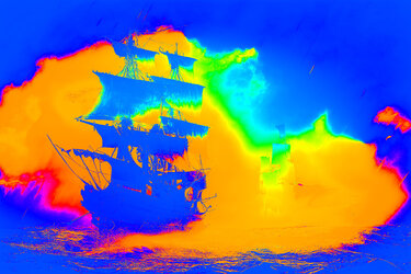
I did a hue map of your original image which shows the Hue components over the image (at maximum saturation for easy to see colors).
The areas of green are much more limited that what you had circled so that has me puzzled.
If you are seeing more green than in the Hue map, there is the possibility that your monitor may not be properly color calibrated.

Nice imarge btw with the gray areas with a sight tint of blue.

Are you using a color calibrated monitor? It may be a factor in having a forum member try and get the look you desire.
Just my own thoughts and suggestions of course.

John Wheeler

Ships-in-storm-2500-x1667-hue-map.jpg
 

JeffK

Guru
Messages
2,486
Likes
2,890
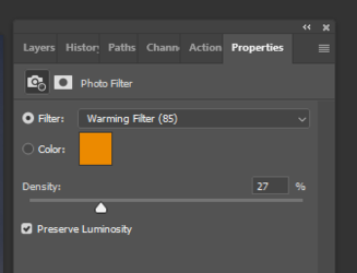
The coior shift is a very subtle one. As @ex_teacher had mentioned, Photoshop offers several ways to get you to where you want to go. I went a different route and used a photo filter adjustment layer to warm up the indicated areas.

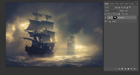
Using the red circled area as a template, I selected the same area with the lasso tool. The I selected the photo filter adjustment layer by going to the bottom of the layers panel and clicking on the half-moon icon, This gave me a layer that masked the selected area and kept the adjustment isolated to that area.

Then using the default warming filter, I adjusted the density slider:

1670804663501.png

Here is how the image looked with my workspace:

1670804727965.png

Here's the full size:

ship in storm edited.jpg

Just another approach. You can try other filters as well or even choose your own.

*EDIT - @thebestcpu raised some interesting issues. One I thought of is the differences in monitors. What I see is not necessarily what you see....

- Jeff
 

thebestcpu

Guru
Messages
2,989
Likes
2,750
Hi @Thor Thorsson
Not knowing what is causing the color tint you are seeing, what I did for my try is take the low saturated areas and reduced the saturation some in those areas.
It may not be what you want yet I think it does reduce some of the color tints in the gray areas and leaves the color alone in the higher saturated areas.
Just my best guess on what you want.
John Wheeler
Ships-in-storm-2500-x1667-reduce-sat-in-low-sat-areas.jpg
 

Thor Thorsson

New Member
Messages
3
Likes
4
Hi Babine, ex_teacher, thebestcpu and JeffK! Thanks a lot! I am overwhelmed by your great interest in my problem. Your edits looks excellent.

And Yes thebestcpu, in answer of your question, I'm using a calibrated monitor.

I have used thebestcpu's edit and edited it further. I edited it in Lightroom adding contrast. I made several masks. I darked down the sails and brushed back the yellow sunshine color in the area that before was greenish. And I made the area near the border of the image border slightly more blueish.

Here is my edit:

Thor's edit of thebestcpu's image.jpg

Now the image fits well on the front cover of the book I am designing. Here is the cover:

Front cover .jpg

Thanks for your help removing the green tint! I could not manage to do it by myself.
 

thebestcpu

Guru
Messages
2,989
Likes
2,750
Thanks for sharing your end result @Thor Thorsson and the cover looks great.
If I translated the title correctly it reads along the lines of:"
"Navigate through life's storms and cuts"
Best wishes for you and your book
John Wheeler
 

Trevoc

Member
Messages
13
Likes
14
One of the great things about Photoshop is the huge variety of methods that can be employed depending on desired output, skill sets of the user and how much effort is expended.
The absolute easiest way for me to approach this (with all its limitations) is to duplicate the original image and paint over the new layer using a very large feathered brush in COLOR MODE at, say, 35% opacity and/or a reduced flow. I sampled a base middle-ish cool AND warm tone and swap back and forth as I paint. After a quick setup I painted for maybe 15 or 20 seconds in the areas I didn't like. Having a duplicate layer allows me to A/B layers checking on my progress.

It took a lot longer to type this than produce this result.. In any event the OP should edit to their preferred look.

View attachment 134134
You used the color mode, but what color did you paint with? I know you created another layer, but what color did you sample for your feathered coloring?
 

ex_teacher

Guru
Messages
569
Likes
1,179
You used the color mode, but what color did you paint with? I know you created another layer, but what color did you sample for your feathered coloring?
If you look at thebestcpu color map above you will see 3 predominate areas; warm tone areas, blue cool tone areas and a green area (which is what the OP was concerned about.)

I’m showing an example of three areas I choose to look at:
1. The offense color is (110,120,110) Think of it as (110,110,110) GRAY with a green cast. And that is what we are trying to avoid.

2. I also sampled on the left a (130, 120,100) which we can think of as a (100,100,100) GRAY with an orange cast (or reddish yellow)

3. And of course the cool tone (65,65,80) with is a (65,65,65) GRAY with a blue cast.

I don’t exactly remember what colors I actually used but it is a good bet I used a big feathered brush lightly alternately painting with the last two colors in COLOR mode until I liked the look.

Ships in storm SampledRGB.jpg
 

Trevoc

Member
Messages
13
Likes
14
If you look at thebestcpu color map above you will see 3 predominate areas; warm tone areas, blue cool tone areas and a green area (which is what the OP was concerned about.)

I’m showing an example of three areas I choose to look at:
1. The offense color is (110,120,110) Think of it as (110,110,110) GRAY with a green cast. And that is what we are trying to avoid.

2. I also sampled on the left a (130, 120,100) which we can think of as a (100,100,100) GRAY with an orange cast (or reddish yellow)

3. And of course the cool tone (65,65,80) with is a (65,65,65) GRAY with a blue cast.

I don’t exactly remember what colors I actually used but it is a good bet I used a big feathered brush lightly alternately painting with the last two colors in COLOR mode until I liked the look.

View attachment 135990
I'm sure what all this means, but thank you for taking time to explain. Perhaps someone else will benefit from your reply!
 

Top