What's new
Photoshop Gurus Forum

Welcome to Photoshop Gurus forum. Register a free account today to become a member! It's completely free. Once signed in, you'll enjoy an ad-free experience and be able to participate on this site by adding your own topics and posts, as well as connect with other members through your own private inbox!

Specific Large print at print store = to dark


Butters

Member
Messages
18
Likes
2
I did the Astemo and well, its obviously brighter than the rest.
When I got this printed out at 18x20 - looked great, only issue is its too dim. The "Astemo" isn't. Hanging on the wall with a nice frame, its just to dim.

So should simply the brightness get bumped up? Or what would you do? I really don't want to on my end try to crop out the logo and ribbon on my end, maybe I'll just have to.

It looks great on the monitor, everything's set to "0" and no filters etc used in Nvidia control panel colors area but its just slightly to dim.
Thank you!!!
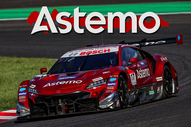
X2 upscaled-enhanced Estemo Ribon 2023.png
 
HI @Butters

There could be several things going on, and in order of likelihood, here is what I think is going on:

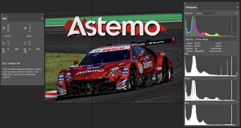
1) Your monitor brightness is set too high, so when it looks right on your monitor, it will print darker than you see. The monitor's brightness should match the brightness of the illumination on the picture in your room. That is typically in the 90-100 cd/m^2. This is a classic issue in color calibration and profiling. Setting the monitor's brightness is a vital part of the calibration step. I believe this is the case in the image below. I provided the histogram for the image, showing that the color numbers are mostly in the lower half, indicating that it is post-processed to be too dark.

2) In addition, the printer is probably not doing any autocorrect for an overall brighter image when it comes in with dim color data. It is actually desired not to autocorrect if you are using a calibrated and profiled monitor with color-managed software.

3) Your posted image did not have an attached IICC profile. When this occurs, it is usually printed as it was in sRGB color space. If that is the color space in which you did your editing, there is no issue. However, if you had set your processing space to, e.g., Adobe RGB and it was interpreted as sRGB by the printer, it not only would have slightly lower saturation, but it could also make some colors darker. In the image below, there is a vertical black line. On the left is assuming you are in sRGB, and on the right is if the color data was actually in Adobe RGB. Note the red colors are brighter.
It is best practice to attach the color profile to your image

4) The printer poorly processed the image. This can happen, but not as often these days.

5) If by some chance you did have an attached ICC profile to the image that was sent to the printer, if the printer only accepts sRGB images, you could have the same problem.

Hope this helps
John Wheeler

Screenshot 2024-03-16 at 4.04.39 PM.jpg
 
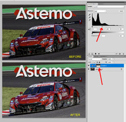
If you are looking for ways to increase the brightness while leaving the Astemo title alone, there are many ways you could do that. Here is a simple one:
  • Add a Levels adjustment layer.
  • Move the midtone slider to the left, as shown below (where red arrow is pointing).
  • In the layer mask of the Levels adjustment, use the gradient tool to add a gradient from white at bottom to black at top. That will brighten the image while leaving the Astemo title mostly unchanged.
  • As an option, you can also add a Vibrance adjustment layer to increase the saturation. I did not do that here.
  • Before & After shown below.

Untitled-1.jpg
 
HI @Butters

There could be several things going on, and in order of likelihood, here is what I think is going on:

1) Your monitor brightness is set too high, so when it looks right on your monitor, it will print darker than you see. The monitor's brightness should match the brightness of the illumination on the picture in your room. That is typically in the 90-100 cd/m^2. This is a classic issue in color calibration and profiling. Setting the monitor's brightness is a vital part of the calibration step. I believe this is the case in the image below. I provided the histogram for the image, showing that the color numbers are mostly in the lower half, indicating that it is post-processed to be too dark.

2) In addition, the printer is probably not doing any autocorrect for an overall brighter image when it comes in with dim color data. It is actually desired not to autocorrect if you are using a calibrated and profiled monitor with color-managed software.

3) Your posted image did not have an attached IICC profile. When this occurs, it is usually printed as it was in sRGB color space. If that is the color space in which you did your editing, there is no issue. However, if you had set your processing space to, e.g., Adobe RGB and it was interpreted as sRGB by the printer, it not only would have slightly lower saturation, but it could also make some colors darker. In the image below, there is a vertical black line. On the left is assuming you are in sRGB, and on the right is if the color data was actually in Adobe RGB. Note the red colors are brighter.
It is best practice to attach the color profile to your image

4) The printer poorly processed the image. This can happen, but not as often these days.

5) If by some chance you did have an attached ICC profile to the image that was sent to the printer, if the printer only accepts sRGB images, you could have the same problem.

Hope this helps
John Wheeler

View attachment 143449
I can't thank you enough for the extremely detailed explanation. To be honest, I'm gonna have to come back to this one tomorrow, thats some great information there. Far, far outside where my brain was :joy: But I can tell, before I come back to digest some more of this, the first thing is calibrating the monitor. But from I remember, it's not in a 'game' mode, nor is the gamma, contrast or brightness boosted or reduced. So this is a true starting point because obviously, this needs to get addressed first.

BTW: This is Walmarts print service, yes there are many other options and places but the price is right and doing 18x24's and up for other work - the price can't be beat.
Unless someone knows of another place hehh. Thanks a ton Tom!!!
 
If you are looking for ways to increase the brightness while leaving the Astemo title alone, there are many ways you could do that. Here is a simple one:
  • Add a Levels adjustment layer.
  • Move the midtone slider to the left, as shown below (where red arrow is pointing).
  • In the layer mask of the Levels adjustment, use the gradient tool to add a gradient from white at bottom to black at top. That will brighten the image while leaving the Astemo title mostly unchanged.
  • As an option, you can also add a Vibrance adjustment layer to increase the saturation. I did not do that here.
  • Before & After shown below.

View attachment 143450
Thank you as well!! I've never seen that technique used, very, very interesting. I'm definitly going to mark this one down to remember. I see some other options injected into this route as well.

To the both of you - Thank You. Really appreciate it!
 
I would be difficult for me to add any technical opinion beyond what John and Rich have offered. My first thought was whether you had assigned a profile to the image but that would affect color. I tool the above image and ran it thru Camera Raw on auto just to see what was changed - the shadow slider moved significantly. So that might be the difference between what you see on the monitor and what info the file actually has. going by what John wrote, the image is darker than what you see on the monitor.

There is one other option - when you bring the file to Walmart, do they allow you to view the file on their monitor before they print? If they're printing darker than what they see on their own monitor, then they have a calibration problem.

It's quite a challenge when you bring your images to an outside source...
 

Back
Top