What's new
Photoshop Gurus Forum

Welcome to Photoshop Gurus forum. Register a free account today to become a member! It's completely free. Once signed in, you'll enjoy an ad-free experience and be able to participate on this site by adding your own topics and posts, as well as connect with other members through your own private inbox!

Specific Miami Heat Style Font


Iker

New Member
Messages
2
Likes
0
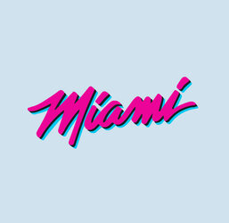
I'm trying to replicate the new Miami Heat Vice style font but to read...
Line 1 - Sunday
Line 2 - FUNday

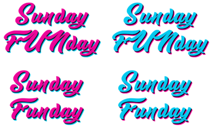
Can anyone create it? If so can you do one with the pink on top of blue and another one blue on top of pink? Thank you!!

C4F5E825-4D76-4626-97C1-5FCC94F59263.jpeg

4296829E-5042-4C95-AECF-B53401716570.jpeg

88447652-0FC6-4BA6-B399-44A9BCFE5BC1.jpeg
 
I don’t know if this is an explanation or an excuse.

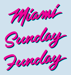
I didn’t understand the instructions so I included the 3 key words here in similar format and colors to the original. The OP needs to spell out exactly what is wanted and word it for a blind idiot…I won’t be offended. This design is on a variety of layers so I can easily repost with a transparent background or solid colors as the OP desires and mix and match words on multiple images if needed. The work is done and that should be a trivial effort on my part.

I have used the actual fort or one VERY similar, although I had to seriously adjust the kerning by hand.. There was also an unpleasant surprise. The last ‘i’ in Miami had to be completely hand drafted from scratch. Notice it has no resemblance to the first ‘i’ which is natively in the font itself. Also the tailing slash looks great but it also is not in the font itself. I ripped off trailing ‘i’, reconstructed a similar one to the original 'Miami' then added a similar tail/slash by hand to the ‘y’ in Sunday and Funday. I also had to change the aspect ratio of the font output. The biggest departure to what I could understand of the instructions was A lower case ‘u’ and ‘n’ in Funday. An upper case ‘FUN’ in anything like this font looked abysmal

Maimi-heat-_varient_6a.jpg
 
Last edited:
This submission is the way I understood the requirement. Also, the "FUNday" text with capitals did not seem to suit this font, so I gave an alternative with "Funday". Both in 'Blue top Pin bottom' and Pin top Blue bottom' variations. I went with a similar looking free font, so it could vary from the original by a bit.
After-Miami-88447652-0FC6-4BA6-B399-44A9BCFE5BC1.png
 
I don’t know if this is an explanation or an excuse.

I didn’t understand the instructions so I included the 3 key words here in similar format and colors to the original. The OP needs to spell out exactly what is wanted and word it for a blind idiot…I won’t be offended. This design is on a variety of layers so I can easily repost with a transparent background or solid colors as the OP desires and mix and match words on multiple images if needed. The work is done and that should be a trivial effort on my part.

I have used the actual fort or one VERY similar, although I had to seriously adjust the kerning by hand.. There was also an unpleasant surprise. The last ‘i’ in Miami had to be completely hand drafted from scratch. Notice it has no resemblance to the first ‘i’ which is natively in the font itself. Also the tailing slash looks great but it also is not in the font itself. I ripped off trailing ‘i’, reconstructed a similar one to the original 'Miami' then added a similar tail/slash by hand to the ‘y’ in Sunday and Funday. I also had to change the aspect ratio of the font output. The biggest departure to what I could understand of the instructions was A lower case ‘u’ and ‘n’ in Funday. An upper case ‘FUN’ in anything like this font looked abysmal

View attachment 135890
Looks amazing, thanks a lot.
Could the F be flipped in the same way as F, because its looks like a 7 and Can you send it without it being on the blue background? Thanks 🙏
 
I took the liberty of stealing the idea from Polarwoc of separating Fun/Sun > day. I could be just a fluke of the font but its elegant. The original 'F' is typical script-like but admittedly it isn't as readable as a conventual printed 'F'. Flipping it doesn't work but I fabricated one as best I could...couldn't find a font that worked.

Here it is on a clear background in PNG format.

Maimi heat _varient_9.png
 

Back
Top