
Photoshop Gurus Forum
Welcome to Photoshop Gurus forum. Register a free account today to become a member! It's completely free. Once signed in, you'll enjoy an ad-free experience and be able to participate on this site by adding your own topics and posts, as well as connect with other members through your own private inbox!
You are using an out of date browser. It may not display this or other websites correctly.
You should upgrade or use an alternative browser.
You should upgrade or use an alternative browser.
Not much for photography but...
- Thread starter Zef
- Start date

Tom Mann
Guru
- Messages
- 7,125
- Likes
- 4,312
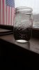
Because of weathered wood and the Mason jar, and no evidence of "today", it harkens back to an older, more patriotic era in the US. It definitely has possibilities, Zef.
Here's some things to think about:
1. You've got an awful lot of blank, black space at the bottom of your image. Sometimes, such an area can serve as "negative space" and contribute to the overall geometry of the image. Often it can change the visual balance in such a way that the movement of the viewers' eyes over the image are better controlled.
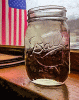
Unfortunately, in this case, I don't think it contributes anything to the image. In the tweaked example attached below, I cropped most of the blank area away. I may have gone too far in this direction, but at least it will give you an idea of how a tighter crop would look.
2. Your camera isn't straight, and it isn't being held perfectly horizontal, so lines that should be vertical have picked up both a general tilt and are converging. In my tweaked example, I reduced these effects.
3. The Mason jar slightly overlaps the flag. In photo circles, this is termed an "unintended join", and usually is not considered desirable. The usual recommendation is to shoot from a slightly different position so that the two objects are either clearly separate, or overlap to a larger extent, so the overlap is not suspected of being inadvertent. My tweaked example is an animated GIF that alternates every 5 seconds between the original slightly overlapped version and a version where they are completely separate. It's your call which you prefer.
Personally, for me, the psychological importance of the Mason jar is low and of questionable significance. If it were an object of more importance (eg, an urn containing a soldier's ashes), I would lean to the separated version, however given what it is, I would not pull them apart.
HTH,
Tom M
Here's some things to think about:
1. You've got an awful lot of blank, black space at the bottom of your image. Sometimes, such an area can serve as "negative space" and contribute to the overall geometry of the image. Often it can change the visual balance in such a way that the movement of the viewers' eyes over the image are better controlled.
Unfortunately, in this case, I don't think it contributes anything to the image. In the tweaked example attached below, I cropped most of the blank area away. I may have gone too far in this direction, but at least it will give you an idea of how a tighter crop would look.
2. Your camera isn't straight, and it isn't being held perfectly horizontal, so lines that should be vertical have picked up both a general tilt and are converging. In my tweaked example, I reduced these effects.
3. The Mason jar slightly overlaps the flag. In photo circles, this is termed an "unintended join", and usually is not considered desirable. The usual recommendation is to shoot from a slightly different position so that the two objects are either clearly separate, or overlap to a larger extent, so the overlap is not suspected of being inadvertent. My tweaked example is an animated GIF that alternates every 5 seconds between the original slightly overlapped version and a version where they are completely separate. It's your call which you prefer.
Personally, for me, the psychological importance of the Mason jar is low and of questionable significance. If it were an object of more importance (eg, an urn containing a soldier's ashes), I would lean to the separated version, however given what it is, I would not pull them apart.
HTH,
Tom M
Attachments
Zef
Active Member
- Messages
- 30
- Likes
- 25
Because of weathered wood and the Mason jar, and no evidence of "today", it harkens back to an older, more patriotic era in the US. It definitely has possibilities, Zef.
Here's some things to think about:
1. You've got an awful lot of blank, black space at the bottom of your image. Sometimes, such an area can serve as "negative space" and contribute to the overall geometry of the image. Often it can change the visual balance in such a way that the movement of the viewers' eyes over the image are better controlled.
Unfortunately, in this case, I don't think it contributes anything to the image. In the tweaked example attached below, I cropped most of the blank area away. I may have gone too far in this direction, but at least it will give you an idea of how a tighter crop would look.
2. Your camera isn't straight, and it isn't being held perfectly horizontal, so lines that should be vertical have picked up both a general tilt and are converging. In my tweaked example, I reduced these effects.
3. The Mason jar slightly overlaps the flag. In photo circles, this is termed an "unintended join", and usually is not considered desirable. The usual recommendation is to shoot from a slightly different position so that the two objects are either clearly separate, or overlap to a larger extent, so the overlap is not suspected of being inadvertent. My tweaked example is an animated GIF that alternates every 5 seconds between the original slightly overlapped version and a version where they are completely separate. It's your call which you prefer.
Personally, for me, the psychological importance of the Mason jar is low and of questionable significance. If it were an object of more importance (eg, an urn containing a soldier's ashes), I would lean to the separated version, however given what it is, I would not pull them apart.
HTH,
Tom M
Thanks man for the detailed feedback much appreciated, yeah this is just a shot i took with my phone. Like i said not much for a camera man but i will keep the info you said in mind when i go for a decent shot next time. This shot actually was in a restaurant i was in and i rested my class (mason jar) on the ledge and figured i would snap a pic.
ibclare
Queen Bee
- Messages
- 9,890
- Likes
- 4,028
I like it Zef. I agree with Steve's changes which make a huge difference. Just a leveling change, increased sat or vibrance and maybe color balance, I'm guessing, would strengthen the original pic. I also like cropping off the excess black space as Tom did. It doesn't contribute anything.
He was right about the skewing; can't expect miracles from a phone. However, keep in mind that you can take a few seconds more to line things up, include a whole image in the frame, keep trees from popping out of people's heads, and so on. I think you have a good start, a good eye, and I hope you get a decent, real camera soon. You would have fun with it and learn a lot.
I personally like the join between the flag and the jar. I think it has the effect of symbolism, even if unintentional. I think the composition has integrity and I like it better actually than when it is moved to the right. Keep up the work and use Photoshop to improve your images as you have seen done here. Keep posting them!

Tom Mann
Guru
- Messages
- 7,125
- Likes
- 4,312
I *really* like Paul's tweak. Of course it isn't designed to include the physics of the situation (ie, true rendering / optical ray tracing), but, to my eye, it sure enhances the emotional impact and thereby steers the OP (as well as us) in a good direction. I even like the return to muted colors.
Great job, Paul.
T
PS - Nice crop, too.
Great job, Paul.
T
PS - Nice crop, too.
Steve
Retired Administrator
- Messages
- 7,720
- Likes
- 1,475
Like you mentioned there was a vibrance also clipping adjustments in ACR.Nice job Steve, what steps did you use?
Then I cheated with Topaz Simplify and also boosted saturation.
If just in PS add vibrance and saturation, a curves adjustment, and smart blur gets you close.

Tom Mann
Guru
- Messages
- 7,125
- Likes
- 4,312
Clare: "...It's beginning to look like Topaz should be a required plugin for Photoshop!..."
It shouldn't be expressed in the singular. Topaz puts out many different plugins. I have most of them. Some are really useful / unique, others much less so, at least, IMHO.
T
It shouldn't be expressed in the singular. Topaz puts out many different plugins. I have most of them. Some are really useful / unique, others much less so, at least, IMHO.
T
