What's new
Photoshop Gurus Forum

Welcome to Photoshop Gurus forum. Register a free account today to become a member! It's completely free. Once signed in, you'll enjoy an ad-free experience and be able to participate on this site by adding your own topics and posts, as well as connect with other members through your own private inbox!

Please critique for a school project


Barb Schaarschmidt

Active Member
Messages
33
Likes
11
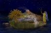
Hello all. My project for this beginning computer art class was to do a photoshop composition illustrating a myth. The myth I chose was an Iriquois creation myth. I am confident that I got all of the story elements, but I would really appreciate any technical or artistic comments. This is a work in progress (I still have a week before it is due).myth v9.jpg

I notice in the preview an artifact near her hand and the stars that does not appear in the .psd. I will work on that. Any other comments would be greatly appreciated.
 
It's nice and all, but the sky buggs me, it needs more texture to go with the rest of the picture. Thats just my opinion thou!

Keep the good work up! :)
 
yeah i recommend adding a b&w difference clouds set to overlay on the sky, lower the opacity to taste


honestly not a fan of the texture in the tree either
 
I hate the tree. I've had a lot of trouble with it. It's very important to the story that I'm illustrating, so I can't scrap it. I think I'm going to replace it with a new tree altogether.

I like the idea of the cloud overlay in the sky. I need some sort of texture. I wanted to avoid a gradient as I hate them in principle. I'll work on texturing it.

Do you think I was able to achieve any sort of perspective? I was warned by my instructor when I started this project that I may have trouble with that. Do you think it works as is (in respect to perspective)?
 
If you still have all the stars on a seperate layer, how about giving them a light yellow inner glow and a white outer glow in the blending options?
View attachment 14491
Also, if you have elements that look like a water colour painting, the rest of the artwork would probably look better, or at least less of a collage, if all the elements are in that style.

good stuff though.
 
Here are a bunch of updates based on class critique. I could really use another look. Any comments would be appreciated.
 

Attachments

  • myth v12.jpg
    myth v12.jpg
    298.8 KB · Views: 5
The updated version's really good :)

Here's what I'd change; I'd add a reflection for the girl, blur the edges of the smoke coming out the volcano and maybe vary the opacity of the stars.
 
Well school projects have come along way since we used ms paint back in the days of first actual computers coming into our schools

Good Job
 
Thanks. However, even though this is a beginner's class I took some more advanced classes last semester. I'm in this one just to fulfull a requirement. Still, there's something to be learned in every class I find.

I hear you about how things are coming along though. My first AS3 class blew my mind...the last programming I did was in BASIC on my TRS-80. :)
 
Here are a bunch of updates based on class critique. I could really use another look. Any comments would be appreciated.

Well, overall I like it. But I do have some critique; remember just from my perspective.

The hair: there is too much blur and halo; it should be more subtle. The girl: i'm glad you cooled the color, but it feels like you've given up too much color throughout. The girl is floating above the rocks. She needs shadows to ground her. The tree: much better. The crosshatching wasn't working; might have if it had been combined with other textures. The tree and the girl are the only things with any contrast. That bothers me. The foreground ought to have contrast. As things recede into the background they blur. But they are sharp when they are in front. The waterfall: I liked it better before. If it needed to be more transparent I can see that, but I think it is too transparent and it looks like a ghost presence on the rocks. OTOH, if that's the point, then congrats, you did it. The flowers: I liked the touch of these even if they were a little too bright or too many or too large or something. They made a nice balance to the girl and the waterfall/stream. The volcano: is alright but I would have liked to see some of the brightness of fire preserved. After all, this is a story, right? Seems you can take a few liberties with reality.

Hope you don't think I was trying to be hard on you. Keep up the good work.
 
Well school projects have come along way since we used ms paint back in the days of first actual computers coming into our schools

The first ones I remember were Acorns with green screens and 10Mb's of memory. Databases and maths type games were all we did, no sign of paint in them days. :shocked:
 
Not too hard at all...that's exactly the kind of thing I'm looking for. Encouragement is great, but you don't learn much from it.

I didn't even think of increasing the contrast in the front. That's a really great point (as are all your points). I had originally done the crosshatching because I had a specific reason to use that girl, but she was in a different style from all of the photographs I was using. My instructor said that it was a good instinct to try to match the rest of it by making it "painterly", but that everyone in the world uses the crosshatch preset and to avoid it because it looks very amateur. Once I did my changes, he was absolutely right. But when I made my changes, it did make everything a little hazy and lost both perspective and contrast. The changes you suggested are just what I need to bring depth and interest back in. I'll give these a go today or tomorrow and post the results. Thanks again.
 
Ha ha. I noticed after I posted this here (and a couple of other places) that the reflection is backwards. Oops. I've fixed it (and a couple of other small flaws). I feel silly.

I sure will let you know what I get. As this is an introductory course, I'm guessing I'll do fine.
 
It's very nice. You did a good job of asking for help and even more of taking it, and in such a good spirit. Don't be embarrassed. For some reason, ??? , for many of us, things look different up on the forum display than they do in PS. Maybe it's because you know your work is in the public eye, so you pick over it. That's a good thing.

Enjoy your results and come back to show us more of your works, completed or in progress. Actually even "completed" works often turn out to be works in progress. :mrgreen:
 

Back
Top