WhoSentYou
Active Member
- Messages
- 43
- Likes
- 11
- Price
- 15
Hallo!
I had a great experience working with a guru here yesterday, who seems to be quite busy Mon-Fri, so I figured I'd post this openly. It's shorter and simpler than yesterday's.
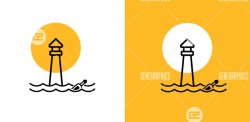
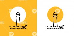
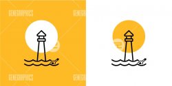
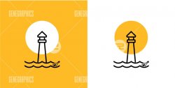
Basically, I need to mix this lighthouse:
With this bottle: (2nd column, 2nd from top-down)
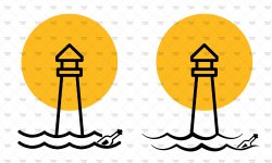
Into this concept, courtesy of my crappy MS Paint skills:
No need to straighten the position of the bottle or make it larger; I like it slanted. That said, I'm open to any creative suggestions (and would even expand the budget for the right idea or design element). For instance, I was wondering whether the lower wave might look okay if we extended it a bit on either end, but who knows?
I'd like to have two versions of it:
1. On the white background, taken from the top center image of the lighthouse file.
2. On the yellow background taken from the bottom right of the lighthouse file.
Happy to offer $15 for anyone's time and trouble!
I'd appreciate having it in a high-quality JPG (well, as high as the source file allows, anyway!). Time is very short....I'm afraid I'd need it by 2 AM PST 11/30, which is in....eight hours. Not a big deal for a small request, but I realize some folks may have other tasks to attend to for that window. Thanks so much!
Last edited:

