Photoshop Gurus Forum
Welcome to Photoshop Gurus forum. Register a free account today to become a member! It's completely free. Once signed in, you'll enjoy an ad-free experience and be able to participate on this site by adding your own topics and posts, as well as connect with other members through your own private inbox!
You are using an out of date browser. It may not display this or other websites correctly.
You should upgrade or use an alternative browser.
You should upgrade or use an alternative browser.
Rate my grphic please
- Thread starter redsliver
- Start date
Twelvebitstyle
Well-Known Member
- Messages
- 50
- Likes
- 38
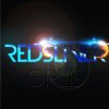
Nice background, nice use of font and effects. i really like the sparks, the contrasting colors are good. Not a big fan of the lens flare though. ill give this a 7 out of 10.
Twelvebitstyle
Well-Known Member
- Messages
- 50
- Likes
- 38
That is up to you. Lens flares can add a subtle design element and break up some space... maybe you could experiment with some cloud/fog/gradient? I just kind of feel like lens flares are a bit played out and over used, that is just my opinion though
ibclare
Queen Bee
- Messages
- 9,890
- Likes
- 4,028
I agree too. But I can see where it gives an illusion of depth if that is what you were thinking.
My only issue with the design is that the right side of it is cramped, very nearly cut off altogether and that bothers me.
Otherwise, good work. :mrgreen:
My only issue with the design is that the right side of it is cramped, very nearly cut off altogether and that bothers me.
Otherwise, good work. :mrgreen:
Sierraccr
Power User
- Messages
- 429
- Likes
- 275
I wanted to share these brushes with you. They are free to download (may the Maker bless DeviantArt!!). I have found them to be waaaaay more useful than I thought they would be when I first tried them out, and often as a substitute for a lens flare. They might not suit in this application, but worth a try.
http://jen-ni.deviantart.com/art/Star-Brushes-40617529
http://jen-ni.deviantart.com/art/Star-Brushes-40617529
im a fan of it with the lens flares - 9/10thanks , you think that I should remove the lens flare ?
do agree with opus needing a lil more to make it pop
agentmoeller
Guru
- Messages
- 1,349
- Likes
- 1,014
I would suggest only one 'spark.' Two opposing sparks makes it look busy. It is, by nature, a focal point, and you can't have two of them in a logo.
Agent
Agent
longlivemedia
Active Member
- Messages
- 41
- Likes
- 3
The lens flare is defiantly overwhelming on this and when I see lens flares used like this my brain automatically feels it looks unprofessional. I want to say I’d give it a 6/10 without the flare, but it also looks like the sparks are identical, but the lens flare is blocking most of the middle one so it’s hard for me to grasp an opinion on it.
awesome2 thumbs up.. how did you do the flare and text? hehehe..

Little Big Designs
Member
- Messages
- 12
- Likes
- 1
great sci fi feel to it 8

