Photoshop Gurus Forum
Welcome to Photoshop Gurus forum. Register a free account today to become a member! It's completely free. Once signed in, you'll enjoy an ad-free experience and be able to participate on this site by adding your own topics and posts, as well as connect with other members through your own private inbox!
You are using an out of date browser. It may not display this or other websites correctly.
You should upgrade or use an alternative browser.
You should upgrade or use an alternative browser.
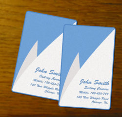
Simplistic b. card
- Thread starter Dominik
- Start date
-
- Tags
- businnes card
dv8_fx
Retired Administrator
- Messages
- 13,761
- Likes
- 4,789
Now this card has possibilities. Most especially if you use silver & gold hot-stamping for the "sails" (That's a process used by printing bureaus ) .... It would look stunning...
But it's for a sailing course, the colors you chose would do fine.
But it's for a sailing course, the colors you chose would do fine.
northlandhusky
Active Member
- Messages
- 30
- Likes
- 1
Simple lines, crisp, clear......very elegant.....I like it!
chrisatlemon
Well-Known Member
- Messages
- 78
- Likes
- 5
I think that's a very nice job, congratulations. For me this is ready to ship.
If you do want to play around with it some more because we feel an itch, the only thing I could think about is that you could maybe play with fonts. Use two different ones. Font combinations are fun and may add that little extra something.
Completely unnecessary though, it is just fine the way it is. Also good decision on keeping it flat with no extra drop shadows, Overlays and gradients. Much cleaner this way, I don't think these extra decorations have any place on a business card.
Well done!
Chris
chrisatlemon
Well-Known Member
- Messages
- 78
- Likes
- 5
I like the first one. The one with the photo is probably a little over the top. I have a feeling that may look good in photo shop but not so great in real.
Also from my experience those transparent business cards scratch really easily. I got some myself and I'm not sure I will get them again. If I have them in my wallet for only one day they're already scratched - and that's after they told me I should get the frosted type because the clear type scratches easily! So You probably just need to breathe on the clear ones the scratch them...
Cheers
Chris
edricchapman
New Member
- Messages
- 4
- Likes
- 0
Yes really amazing business card. All are good looks simple but nice and I like the business card with image so much. That card you can use as a business card and as a identity also.
dv8_fx
Retired Administrator
- Messages
- 13,761
- Likes
- 4,789
I didn't see this. At first, I thought plastic business cards were a good idea. But soon learned it wasn't - scratches very easily.
But there is a material - a translucent paper - I forgot what it's called. which would do nicely.
The first design is good - the other half for the client's logo. The second is also good - but depends on the client. If his ego is that big , or his persona the pulling power in what ever he does, it will suit him.
Dominik
Member
- Messages
- 16
- Likes
- 0
That one with a picture is one of my favourites. Not because of a design, which is not that good (but I'm learning), but because it is different. It will stand out from other cards. It will gather attention, and this is a key thing in advertising.
It will of course need to be printed on a really good material, but it also looks ok when the background is just white with a bit of noise added.
It will of course need to be printed on a really good material, but it also looks ok when the background is just white with a bit of noise added.
T
Tanks502
Guest
Its not so bad..Its very well made
I like the second business card, but probably only because its more my style. You know the cards don't need to be die-cut to get the curved corners. You actually get a corner cutting punch like gadget that creates the exact look. Yes, Time consuming if you doing a large amount as its manual punching. But very effective and create a stunning effect to the card.


