What's new
Photoshop Gurus Forum

Welcome to Photoshop Gurus forum. Register a free account today to become a member! It's completely free. Once signed in, you'll enjoy an ad-free experience and be able to participate on this site by adding your own topics and posts, as well as connect with other members through your own private inbox!

Some of my work


MentosCubing

Power User
Messages
400
Likes
428
P.s: Posted them in a spoiler because they were huge and would probably cover a whole page lol, maybe if u can tell me a code or a way to resize them i would edit this post, thanks.
When you upload an image, it should give you an option to choose between "thumbnail" and "full image".
1578950111867.png
If you choose Thumbnail, it will give a small preview that you can click on to show the full resolution.

These are excellent works, for the most part. Your colour matching is especially good.
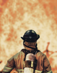
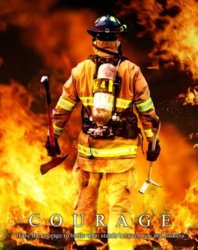
The main thing I see here is that the fire element you used here is very low-res, and the firefighter is sharp and in focus.
1578950085093.png
With a more rounded blur, it could give the illusion of a shallow depth of field or a bokeh effect, but right now you can tell this is just the program's attempt to interpolate more pixels into a massively upscaled image. Saturating the fire a little more could help, but my recommendations are:
1. Try applying a Gaussian blur or Lens blur and see if it still looks good. Experiment with duplicating the layer, using two different blur radii, and changing the opacity or blend mode of the top one.
2. If that does not work, try reducing the quality of all the other layers to match it, or just find/create another fire element to use.
 
Last edited:

TheHeelShow

Member
Messages
8
Likes
5
The main thing I see here is that the fire element you used here is very low-res, and the firefighter is in focus.
With a more rounded blur, it could give the illusion of a shallow depth of field or a bokeh effect, but right now you can tell this is just the program's attempt to interpolate more pixels into a massively upscaled image. Saturating the fire a little more could help, but my recommendations are:
1. Try applying a Gaussian blur or Lens blur and see if it still looks good. Experiment with duplicating the layer, using two different blur radii, and changing the opacity or blend mode of the top one.
2. If that does not work, try reducing the quality of all the other layers to match it, or just find/create another fire element to use.
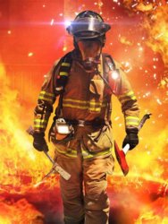
Thanks for the feedback, really appreciate it, actually the fire image is high resolution too, I blured the background so the firefighter would be in focus because since the colors were pretty similar the focus wouldn't be on him. I guess i blurred it more than it was needed. Or I could try to blend the firefighter more with the background, feathering the edges more or i could maybe play with some other settings to see a pleasing outcome.
 

IamSam

Administrator
Staff member
Administrator
Messages
22,721
Likes
13,258
Good work and thanks for sharing. I don't see much other than some minor selection and blending issues in all but the third image down. As @MentosCubing stated, the color matching is great in all images! Dracula's teeth and blood could use some work............but it works for what it is.

The first image probably having the most minor problems with selection and blending. The selection of the fireman seems to be jagged in places. The Roo and the Koala have very hard edges. A slight blur around their edges would have helped in the blending. While the Roo looks pretty natural, when I first viewed the image my eye went straight to the Koala, he's just looks unnatural and pasted in.

Also, what you have is an American city fireman instead of an Australian Forest fire fighter, they have a slightly different appearance and almost never wear Scott Packs. I realize that many other countries sent firefighters to help, but most American volunteers were smoke jumpers/American forest firefighters. After a quick search, I found the image you used as a reference and it was titled as "Fighting a forest fire". This was just a generic image.
51bHnP2g0FL.jpg

Here is a front view of the same firefighter at a structure fire and not a forest fire.
OIP.GL357A9eMQqtanRQt9l06AHaJ4.jpg

I like the message you intended, but you need to remember these types of details.

A few of the selection issues......
Screen Shot 2020-01-14 at 10.35.54 AM.png

Screen Shot 2020-01-14 at 10.29.42 AM.png

Screen Shot 2020-01-14 at 10.29.54 AM.png

Screen Shot 2020-01-14 at 10.30.14 AM.png

Overall, a good start! Keep up the great work and practice, practice, practice!
 

IamSam

Administrator
Staff member
Administrator
Messages
22,721
Likes
13,258
Post #6 image is a nice composite. It's busy, focused, and has nice contrast. Possibly a bit too centered though, maybe take a page from the one in post #5. Remember the rule of thirds.

I can see where you're still having issues with making selections, most notably here:
Screen Shot 2020-01-23 at 9.37.28 PM.png

Any image removed from it's background will show it's most minute flaws against a white or black background. It's better to go with a more neutral color that hides the flaws better. Another trick is to use the Blur Tool to slightly blur the edges.

The white text you chose for IRVING is just too much when mixed in with the white lettering, numbers, and edges around collar and sleeves. I like the idea, but the masked out section of your text is hard to read at first glance. I would have to experiment with other text effects to see what would work here.

This one has been my favorite so far! Thanks for sharing.
 

TheHeelShow

Member
Messages
8
Likes
5
Post #6 image is a nice composite. It's busy, focused, and has nice contrast. Possibly a bit too centered though, maybe take a page from the one in post #5. Remember the rule of thirds.

I can see where you're still having issues with making selections

Any image removed from it's background will show it's most minute flaws against a white or black background. It's better to go with a more neutral color that hides the flaws better. Another trick is to use the Blur Tool to slightly blur the edges.

The white text you chose for IRVING is just too much when mixed in with the white lettering, numbers, and edges around collar and sleeves. I like the idea, but the masked out section of your text is hard to read at first glance. I would have to experiment with other text effects to see what would work here.

This one has been my favorite so far! Thanks for sharing.
Thanks for your kind words and advice, yeah I need to work on the selection, the thing is that the selection was kinda rushed and I'll for sure try blurring the edges. The text yeah was blended badly with the shirt and lettering, I thought that suited the compsition the most with what fonts I had avaiable in my pc, but again thanks for the advice!
 

pauloalex_98

Power User
Messages
210
Likes
79
These look good, however you need to work on the edges. Obviously no one is gonna notice them unless they zoom in or look straight at them, but, to professionals they are going to be noticed for sure.

Other than that, I think they look good and I can imagine these being marketed as posters. They are adequate for it.
 

slavicgirl

Member
Messages
5
Likes
1
Truly awesome work.
I am in awe. I can really tell that you have a talent for making strong visual-emotional impact.

May I ask what you did to the images and how they were originally?

Are you from USA (I'm from Australia and I noticed that your first image has some of our Marsupials).
 
Last edited:

TheHeelShow

Member
Messages
8
Likes
5
These look good, however you need to work on the edges. Obviously no one is gonna notice them unless they zoom in or look straight at them, but, to professionals they are going to be noticed for sure.

Other than that, I think they look good and I can imagine these being marketed as posters. They are adequate for it.
Thanks for your kind words, and thanks for your opinion!

Truly awesome work.
I am in awe. I can really tell that you have a talent for making strong visual-emotional impact.

May I ask what you did to the images and how they were originally?

Are you from USA (I'm from Australia and I noticed that your first image has some of our Marsupials).
Thanks a lot, well the images were renders, or photos that i blended and also added overlays, changed the colors,etc.
I'm from Albania, but around the time that there was a bushfire on Australia I decided to make a poster about it and post it to my instagram page to write something about it.
 

Top