What's new
Photoshop Gurus Forum

Welcome to Photoshop Gurus forum. Register a free account today to become a member! It's completely free. Once signed in, you'll enjoy an ad-free experience and be able to participate on this site by adding your own topics and posts, as well as connect with other members through your own private inbox!

Suggestions Please


Peaches Of The Night

Well-Known Member
Messages
69
Likes
15
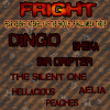
Hi Everyone, I just finished this Pack Banner for the Game I Play & Please tell me what I may do to make it better. This is for Halloween My AO (Ancient One) asked me to do one for Halloween. This is my first one & I will try to do at least 1 more so he can pick the one he likes best.

A Little Information:
FRIGHT ~ Is our Tag for Halloween (the meaning is below)
"Fear Reigns Intensely as the Ghouls of Halloween Thrive"

The ranking Of players & names

Dingo ~~ AO ~~Ancient One~~Top Powers in Pack
Sheka ~~Commander 1 These 2 have the same Power
Sir Drifter ~~Commander 2

These 4 are basically equal in Powers
The Silent One
Peaches
Aelia
Hellacious
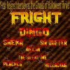
Halloween pack Banner 1.jpg

This is what my Name looks like in Game ~~ [FRIGHT]Peaches ~ Of course there is a color difference also.
Thank you for any & all help on this.
 
I agree with both John and Clare about the spacing of the overall text.

That first sentence is really packed in there, so much so that the left side is off the canvas. It needs to be sized down considerably.

It looks like you may have used Transform to fit the sentence into the space, which is fine until you start altering the height of the text and then it starts to look squished. I would try to avoid this.

Example:

Let's transform this sentence to fit into the red box.
Screen Shot 2013-10-16 at 9.06.42 AM.png

This looks normal after using the transform.
Screen Shot 2013-10-16 at 9.07.31 AM.png

This is what I mean when I say squished! It's when you transform the height of the text.
Screen Shot 2013-10-16 at 9.08.01 AM.png
 
Last edited:
I agree with both John and Clare about the spacing of the overall text.

That first sentence is really packed in there, so much so that the left side is off the canvas. It needs to be sized down considerably.

It looks like you may have used Transform to fit the sentence into the space, which is fine until you start altering the height of the text and then it starts to look squished. I would try to avoid this.

Example:

Let's transform this sentence to fit into the red box.
View attachment 38036

This looks normal after using the transform.
View attachment 38037

This is what I mean when I say squished! It's when you transform the height of the text.
View attachment 38038

Thank You!! I see what you mean & will try to avoid that from now on
 
OPPS!!! I do better!!! Found this in a tutorial

One thing I’ve noticed designers do to make text stand out from the background is to give it a stroke. This does help, but stroking type is like giving it a faux bold in Photoshop! Please don’t!
 
I redid the Image. I having hard time placing the names :( Halloween pack Banner 1a.png
 
Here is a suggestion for all the text. I downloaded your PSD file and took a look.

First thing you need to do is click all the little arrows next to the FX letters on all your layers. That will collapse all the effects you have on the text and make the layers more manageable.

Next click on the top text layer so that it is highlighted blue. Then press and HOLD shift and click on the last layer of text. All the layers that are text should now be highlighted blue. Once you have that press ctrl/cmd+G. This will group all your text in to a folder.

Now, click on the group you created so that it is highlighted in blue. Next press ctrl/cmd+T. This will take you into free transform. You will see a box has appeared around all your text. Take you mouse and hover over the corner of the box until your cursor turns into a line with an arrow on both ends. Now press and HOLD shift then click the left mouse button. Now you can resize all your text at once. By holding shift down you preserve the proportions of the text. When you get it to a size you like, let go of the mouse button FIRST. Then let go of shift. Press enter on your keyboard and you should have all your text away from the boarders.

If you are interested about the free transform tool. Do a YouTube search for a good tutorial. Hope that helped.
 
OMG!!!! Just did your first suggestion!!! I ashamed to sat I had no idea about that & I do like it lots!! Now on to your next Suggestion :thumbsup:

Just got all text layers in their own folder!!!! THANK YOU!!!! These things are going to help me keep from getting frustrated so easily. :wink: Off to next one :)

I dont know what words to use to let you know just how much this will help me. Thank You!!! Just dont say it!! Now I will be able to keep my layers organized & not get lost!! (With the TBI I have, I get lost fairly easy) I am looking at many different Tutorials for the Transform tool also!!! :thumbsup::thumbsup:


I forgot to tell you how very well you explained how & what to do in each step, I greatly appreciate this!! The TBI makes it so hard for me to understand many things. You did it very very well!!!!:thumbsup:
 
Last edited:

Back
Top