My two cents that turned into a twenty dollar bill: And a somewhat different take.
I’m going to start my conversation by telling the story of when I was 12 and decided to make my own Geiger counter. You can guess what happened when I plugged it into the wall. It wasn’t what I knew that was a problem; it was all that I didn’t know that led to disaster and sparks and flames. I think that sort of applies here.
Almost all static imaging fall into “Bitmap’ (ie Raster) or Vector’(ie structured ) graphics.
Paint programs, digital cameras and most of the static internet fall into the Bitmap category and these images are made up of a vertical and horizontal grid of colored or B&W squares ranging from hundreds to millions of these tiny squares. Adobe Photoshop has a rich assortment of tools to create, move, mask and re-color these tiny squares.
In the background far from our prying eyes, Vector (or Structured) graphics are actually mathematical formulas that describe shapes, colors and even transitions of colors. Programs like Adobe Illustrator or Corel Draw have a variety of tools to grossly or subtly manipulate these ‘vector’ shapes in a large variety of ways.
To make this discussion more complex, over the years these programs have added additional feature sets to address the ‘other type of graphic’ so Photoshop can perform some vector operations and Illustrator does basically understand bitmap graphics. Key words: ‘can’ and ‘basically’.
Lets look at the easiest example of that vector/bitmap crossover. Almost certainly ‘Type’ (as in your ‘SCROLL SAW’) resides in a computer as some variant of TrueType or Postscript fonts. These fonts are vector descriptions of letters and/or associated glyfs. In Photoshop we can type something on the screen and change its size up or down with no degradation. At some point we will usually want to ‘Rasterize’ these letters and Photoshop turns them into a bitmap of the size appropriate for the resolution we are working with. These resulting bitmaps are now just a shapely blob of color and while we recognize the blob as , say, an ‘A’ the computer is now treating it as another series of small shapes. You can no longer change a capital A to a small a.
On the other hand our vector programs also bring in the fonts as fonts (as in the letter ‘A’) and for some, if not most work, we will want to change these fonts to ‘Curves’ which is the program’s native
description of that shape. It is now no longer and ‘A’ but just a shape we recognize as an ‘A’ but unlike Photoshop it is still a vector.
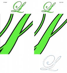
So lets create a fancy ‘L’ in each program, both bitmap and vector, and make the ‘L’ green with a black outline. (see below) You can see that on the screen the top to are roughly the same .Lets look deeper by magnifying them to see what they really are. The bitmap L begins to pixilate and we can clearly see the small squares that make up the L That doesn’t happen with the vector image no matter how we magnify it, It always stays as sharp as the screen we are looking at.
To create this letter in both programs we use a Type tool and choose a color for the font.
To get a black outline in Photoshop we do not have to rasterize and can leave it a native font (at lest for this step) We double-click on that new font layer and choose ‘Stroke’ The will lead us to a flyout that allows us to choose stroke ‘inside’ or in this case ‘OUTSIDE’, a color (black). And a weight (2 pixels) and some other parameters. Its worth noting similar to your example, I could have chosen a ‘White’ color for the font and a black outline…and since it still a FONT it can be scaled greatly without destroying it.
In a vector program we can also leave it in its font form where we have an L ‘that is still an editable L and chose out color, By default fonts have no outline weight but with a click or two we can turn the outline on and pick a line weight and color. In this case I’ve chosen to push the line thickness behind the letter shape so only the part that is larger than the letter shows. Again I could have chosen white to be more like your example.
The last image down on the vector side is that L when seen as an outline where the thickness of that line is merely representing a path. ‘Just because’, I’ve also turned on the control points which control how that line is formed and it allows us to modify those curves should we want to. Again, it has to be changed to curves to do this,
So far I can do simple things that look something like your example.
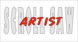
1. ‘Scroll Saw’ in white with a black outline is a no brainer. Same with the small date stamp but with different font size obviously.
2. Things get sticky here. ‘Artist’ would be on the next layer up. again in white with a black outline Then it gets a more complex. We would need to click on that layer and choose ‘rasterize type’ and ‘rasterize layer style’ That rasterize the type and rasterizes the black outline into one bitmap. Then do same Stoke thing again but this time in a thick white outline, again on the OUTSIDE,
3. Since this layer is on top of ‘Scroll Saw’ and is opaque that white outline would cover part of ‘OLL’ & ‘S ‘. And here’s where it gets much more complex. The ‘OLL’ & ‘S ‘. are carved in the correct spots but no black outline is there,
4. at this point its not obvious why... but you need to also raster the type and then the layer style in the SCROLL SAW layer because you will have to process the lettering later.
5. I used the Magic Wand tool and clicked on the background with the Artist layer selected, then go up to ‘Select/Inverse’ and the dropdown menus. That just selects the fat white outline of Artist.
6. You can now use this selection to cut out the appropriate sections on SCROLL SAW but you need to click on that layer first.
7. Then: Shift/Control/J. That actually cuts out that section to a new layer (not the normal Control/J ... ie copy) Now you must then delete that layer which contains unwanted portions of scroll saw
8. You will notice when you ‘rasterize layer style’ the Effect/Stroke sub-set goes away. Well you need to double click on the Scroll Saw layer again add a black stroke on the INSIDE this time.. Not that any of this is intuitive but the first black stroke up in step 1 is not really necessary and in fact counter intuitive when you get to this step and is needed only to see where the white letters are. If you hadn't put a stoke on it then then you would only be adding a black stoke in this step on the OUTSIDE.
9. The artwork is tricky in that you need to find and alter clip art what will work somehow. A vector program has the advantage of it scalability when working with vector clip art and easy changing of fill colors but you still have to find it, buy it or create the artwork.
Personally I think doing this in a Vector program is much easier and more intuitive.
I’m way out of of my league with this but I suspect if you are thinking of doing computer controlled cutting (CNC) you should be using vector format
Good Luck


