What's new
Photoshop Gurus Forum

Welcome to Photoshop Gurus forum. Register a free account today to become a member! It's completely free. Once signed in, you'll enjoy an ad-free experience and be able to participate on this site by adding your own topics and posts, as well as connect with other members through your own private inbox!

Tips to achieve this 60's/70's color layering/mixing text effect?


tomjonesrocks

Member
Messages
6
Likes
0
Hi everyone! I posted this in another forum but got no replies.

This is something I'd like to know how to accomplish.
Any ideas/tips on how to put something like this together? I like this effect...

text1.jpg
 
Don't know what the font is, but I think this would work - (this is from memory, don't have Ps in front of me)

Type out what you want in white, duplicate the layer twice, then change copy 1 to blue, and copy 2 to red. Offset each colored copy to the right or left as desired.

CLT+click the thumbnail of the blue lettering to make a selection. Create a new layer above the white lettering. Choose a lighter color of blue, then hit ALT+BACKSPACE to fill the selection on the new layer. Right-click the layer and make it a clipping mask.

Repeat that step for the red letters. Use the eraser tool as needed to reveal the white lettering where you want it visible. See how that looks.


Agent
 
Have been working with this and although your tips are clear, I don't seem to be getting a result similar to the example. If you try these steps do you get something similar?

Thanks for your reply!
 
OK, so I think I missed an important step.

This is a little closer than what you probably got, but still not there.

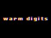
This is what I did. I picked a thick font, and moved the letters far away from each other. (go to character>tracking>200).

I rasterized the layer. I duplicated it twice, naming the copies RED and BLUE. I CTL+clicked each and filled it with its respective color. I created an empty layer above each colored layer.

To get the yellow, I CTL+clicked on the red layer to get a selection. I selected the empty layer above red, and filled it with yellow. To remove the yellow I didn't want, I CTL+clicked on the original white layer to select it, clicked back on the yellow layer, hit CTL+SHIFT+I to invert the selection, then hit delete. That left only the yellow that was direct above white.

I repeated that sequence for the light blue.

I merged all the text layers, and did a gaussian blue of 1.4.

I think a better font would give you more of the white letters exposed, but this isn't too bad.


Agent
:cheesygrin:
 

Attachments

  • disco_theme.jpg
    disco_theme.jpg
    296.2 KB · Views: 0
I'm getting something closer; but it seems there's some translucence creating the pink, etc. Think they're using a lower fill or opacity?
 
I played with the opacity when I was making this. I think it's definitely possible that the different color layers have different opacity settings.

I'm also still wondering how you could get more of the white letters to be visible. It might be a font issue. The letters in the font you posted are so thick, it gives you tons of room to offset and display the different colors.

Keep workin' at it!

Agent
 

Back
Top