What's new
Photoshop Gurus Forum

Welcome to Photoshop Gurus forum. Register a free account today to become a member! It's completely free. Once signed in, you'll enjoy an ad-free experience and be able to participate on this site by adding your own topics and posts, as well as connect with other members through your own private inbox!

Specific Tweak a World War 1 Tank Badge Picture


ebasham

Member
Messages
6
Likes
0
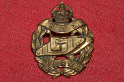
I would like the attached image to have the following tweaks:
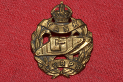
  • Remove red background and replace with transparent background
  • Replace "TANKS" with "BAD" across top
  • Replace "CORPS" with "KARMA" across bottom
This may be impossible, but if it could be done I would appreciate it. I am certainly too ignorant to do it.

TankCorps_Orig.png
 
I wanted to take a shot at this aswell.

G6h55az.png
 
I wanted to take a shot at this aswell.

G6h55az.png
This is great as well. Now I have to choose which one to use... I kind of wish the top letters had about 10-15 px more spacing though. I also appreciate the background removal as well. I really wasn't expecting this.
 
This is great as well. Now I have to choose which one to use... I kind of wish the top letters had about 10-15 px more spacing though. I also appreciate the background removal as well. I really wasn't expecting this.

I will try to change the top letters aswell
 
Much better. Two little requests. The bottom "M" looks inset, and the red outline is a little more evident than I would hope. I know I'm being a bit picky, now but if that could be done, this would be the badge I use. Top spacing is great. Thanks
 
Much better. Two little requests. The bottom "M" looks inset, and the red outline is a little more evident than I would hope. I know I'm being a bit picky, now but if that could be done, this would be the badge I use. Top spacing is great. Thanks

I will see if I can follow up on that but I can't make any promises. The problem with the red outline is that part of it is the reflection of the background in the badge itself.
 
I will see if I can follow up on that but I can't make any promises. The problem with the red outline is that part of it is the reflection of the background in the badge itself.
I definitely understand that. It honestly looks great, I'm just being nit-picky now; however, that inset M would be pretty important to me. Again, I can't thank you guys enough
 
I tried to make some of the red edges a little bit darker.
and tried to make the M look less inset
ztErMj0.png

C9f7E13.png
 

Back
Top