What's new
Photoshop Gurus Forum

Welcome to Photoshop Gurus forum. Register a free account today to become a member! It's completely free. Once signed in, you'll enjoy an ad-free experience and be able to participate on this site by adding your own topics and posts, as well as connect with other members through your own private inbox!

Weird shadow with strongly saturated colors


iconca

Member
Messages
7
Likes
0
Hi,

I've probably pretty dumb problem, but I've tried to look for the answer everywhere and I guess I don't know how to ask the right question.

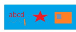
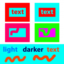
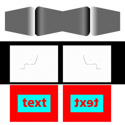
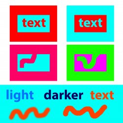
I've never noticed it before, but I'm seeing weird shadows around both, vector and pixel-based objects, when I'm using clashing strongly saturated colors. I think the shadow is still there with more pastel or darker colors but it's less pronounced. It annoys me because it's almost invisible with fuzzy edges, but with hard transitions like with text on colorful background, it creates actually a 3D effect witch I don’t want.

Is this a normal thing, that I’ve just never seen before, or there may be something wrong with my monitor display, color profile or stuff like that. I do use pretty old version off Photoshop (Adobe Photoshop: 13.0.1 x64).

I would be very, very grateful for some explanation.

Bez nazwy-1.jpg
 

IamSam

Administrator
Staff member
Administrator
Messages
22,722
Likes
13,258
Interesting. I'm certain this has been discussed before but I can't find the old thread.

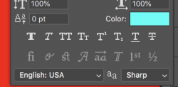
With text, changing your anti-aliasing to sharp helps.
Screen Shot 2021-01-22 at 8.03.10 AM.png
Screen Shot 2021-01-22 at 8.03.24 AM.png
Screen Shot 2021-01-22 at 8.25.01 AM.png

But I can't remember what was done for the brush tool stroke (if anything). The anomaly still exists in later versions of Ps.....
Screen Shot 2021-01-22 at 8.24.01 AM.png

I will continue looking for that older thread on this subject.
 

iconca

Member
Messages
7
Likes
0
Thanks for showing interest.

You're right that anti-aliasing changes the effect a little, but unfortunately doesn’t remove it. By the way I checked and something similar also happens in Paint. It’s guess it’s not a big deal with smaller projects. I’ve noticed it trying to make a big print and it started to mess with readability of text.

Bez tytułu.jpg
 

thebestcpu

Guru
Messages
2,989
Likes
2,752
Hi @iconca
Yes this is pretty normal or anti-aliasing or softness in edges against other colors. The effect becomes more dramatic with highly saturated and complementary colors.
There is also an effect that is an illusion which I will include a bit later.

However, to get more specific, it would be important to share files in a format that does not have lossey compression such as JPEG an only use PNG or TIFF files. The lossey compression introduces some artifacts that have nothing to do with the actual transition between colors. So some issues could be due to using JPEG format yet not the first order issue.

All the anti-aliasing or soft edges does is introduce a small gradient of transparency going from one color to another.
Colors being combined along this gradient can be thought of moving across the color triangle from one color to another

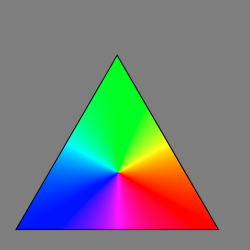
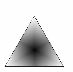
Here is the fully saturated color triangle
Screen Shot 2021-01-22 at 3.24.45 PM.png

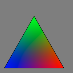
Here is the color triangle with each primary saturation maximum at its corner and zero at the opposite side:

Screen Shot 2021-01-22 at 3.25.26 PM.png


The color transition through a transparency gradient starts at the edge of the triangle at the full saturation point and then draw a line across to the other full saturation point. The colors and saturation that you traverse over the line is what you see in the transparency gradient going from one color to another.

Note that going from Magenta to Cyan goes through Blue, Orange to Cyan goes through green, red to magenta goes mostly through gray. In all cases the colors go through a transition of reduced saturation.

The image below is a saturation map of the image above. Dead center btw is zero saturation:

Screen Shot 2021-01-22 at 3.26.00 PM.png


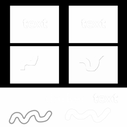
In your example image (even though JPEG) here is the Saturation Map for that image (you will need to click on image an view at 100% to see the detail). Note that as you move from one highly saturated color to another, you often transition through lower saturation.

Also note, that the mathematical combination of the transparency gradient transition has no accommodation or a smooth luminosity transition either.


Its a big clue that this saturation transition occurs right where you see issues in your original image.

Bez-nazwy-1-saturation.png

I am sure there are ways to help reduce this phenomena yet I have not thoroughly investigated the options.
Hope this gives you an idea about what caused the issue.

Now, there is also the issue of illusion

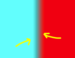
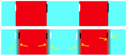
In the image below I created two layers one with red and one with cyan an a linear transparency gradient in the middle of the Layers. Even though the luminosity is linear, right at the edges of the transition it appears brighter on the left side (cyan edge) and darker on the right side (red edge). This is an eye-brain phenomna an is named the cornsweet illusion when there are luminosity transitions at edges. I could provide some pretty stark examples if desired.

John Wheeler

linear-gradient-with-illusion-of-brighter-and-darker-images.png
 
Last edited:

iconca

Member
Messages
7
Likes
0
First, big thanks for so specific and detailed explanation. That helped a lot to understand what’s going on. Especially with the anti-aliasing thing. I had a hunch that it may have something to do with it, but I didn’t know a good way to check it (like Luminosity Mask). That anti-aliasing (with a Luminosity Mask) is really visible on a brush stroke with fussy edge. Now when I know about it, it’s totally understandable. There’s gradually less of the effect on a harder round brush and then, on those hard square brushes. Unfortunately I’m still not sure about the Cornsweet effect, although it’s really interesting and I wouldn’t mind learning more if it’s not a bother).

This is what I mean. This time I worked on tiffs to eliminate compression issues, only used jpgs for screens to avoid unnecessary big files.
On text and on rectangular boxes of a background, I’m not really sure, if there is any anti-aliasing. With Luminosity Mask it shows and disappears depending on a zooming of the image. And when I zoom in on a color version and check individual pixels, they all have the same shade. Plus, I simply turned of text anti-aliasing, so there should be none (at list on letters).
But when I look at my image in color, the 3D-like impression is still there. And while enlarging it, I think you can see, that it’s not really pixel based effect. It looks rather like something happening in the space between pixels. So is this the Cornsweet illusion?
1611504279757.png
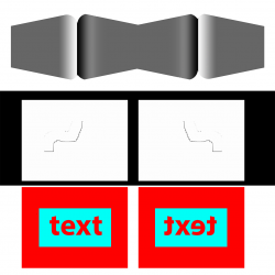
But that is what’s strange for me. Even if this was only an optical illusion based on two color values, shouldn’t it inverse itself, when one copy of an image is rotated by 180 degrees. Like with this image of Cornsweet effect (optical illusion). Or like on brush strokes with visible anti-aliasing through Luminosity Mask (pixel based kind of shadow). However when I tried it with text in Photoshop, the shapes of letters have flipped, while those weird shadows stayed on the same side.

1611504380423.png
Or maybe this is easier way to show it. With white and black lines I exaggerated the pattern I’m seeing in yours and in my example.
1611504516828.png
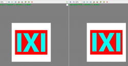
To see if it’s not only Photoshops doing, I tried it outside a program. I did one copy of a text “IXI” (and small L for left and R for right). Saved it as tiff and simply made a copy on my disk. Then I flipped the copy and opened both in my very basic viewer (FastStone Image Viewer).

In 100 and less % zoom view, those shadows are visible on the same side for both versions (for ex. all letters “I” have darker upper and left edges and lighter right and bottom ones).
1611504556238.png
But when I zoom in to 50000% and try to compare those edges with letter L by them (so one bottom and one upper) , I can’t spot any difference. I took a screen of this view end stitched both sides together in Photoshop. Still nothing, so I guess it’s really not written into the image pixels.
1611504683708.png
And in the end I discovered that those shades do change their position, when I actually flip my entire laptop :p.

I stared at those pictures for so long, that I eventually started to think, I may be the only one seeing that shadows (for example due to my astigmatism). I know I probably over-complicate things and I don’t even really expect more specific solution. I just wanted to let you know that I did my homework and I appreciate both replays. It would be nice to understand it, but if it’s too complicated for my level I think I’ll live.

The only explanation I can think of, is that there is same kind of an effect (to do with RGB light mixing or optical illusion) happening on actual monitor pixels (not those represented in Photoshop). Can it be something like that? I guess to check it I probably should print same of those examples. I’m assuming, without any-aliasing, no additional shadows will be visible. Besides maybe some real, optical illusion between specific different colors.
 
Last edited:

thebestcpu

Guru
Messages
2,989
Likes
2,752
Hi @iconca
Let me separate out the issues a bit (CornSweet Illusion covered last.

We already covered JPEG issues when sharing about these subtle issues so that is good.

Also, it probably would be good to separate out an academic issue e.g. why does PS do what it does in different conditions just to know why, and a practical issue in that this is a problem for a final outcome issue that when viewed by the average person or a customer would notice an issue at expected magnification or viewing conditions. It's not clear to me which type of problem you have and maybe you could clarify. Either can be answered/addressed yet there are numerous strange/unique/anomalous ways PS can show an image that don't cause problems in the final work.

When you refer to zooming, we should also be clear if you are only viewing an zooming with PS vs viewing or zooming with a browser or OS commands. In discussing issues it is best to only view and zoom with PS because all sorts of additional issues can occur using other zooming techniques. eg. I can zoom on my Mac by holding own the CNTL key and swipe up or down on the track pad with two fingers. That zooms the display pixels and not the Photoshop image file pixels and it will view differently.

Though I don't think it is relate to the issues you have brought up there are a couple simple steps to avoid some common display issues with PS.
When viewing less that 100%, image pixels must be combined in some fashion to display on fewer monitor pixels. Most often that ends up looking OK yet other times artiacts can be created that have nothing to do with image issues. So for your issues, viewing no lower than 100% magnification will avoid those issues. Also, viewing at highter than 100% magnification, you end up what becomes pixel peeping. You will be viewing the image at a level that will not be seen by the average viewer / customer. So it can be more of an academic issue.

The second thing that can help for some type of viewing anomlies/ artifacts when working with multiple Layers is to Stamp the visible Layers to its own individual Layers. Sometimes PS will display differently.

So for the issues you want explained, just take them one at a time and provide a PNG or TIFF example of the image or partial image (not screenshot) and I bet forum members will help track down what you are seeing and likely get to resolution. So that is my suggestions on moving forward with the items from your immediate post above.

Now for the Cornsweet illusion. I doubt that is the most significant factor in the examples above yet can be contributing when the transparency gradient is relatively large (e.g. soft brush). It has to do with changes in luminosity changes at edges. This link gives a detailed emperical writeup of the illusion: CornSweet Illusion Explanation

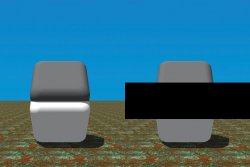
Even better though is the image below. In the image below, the left side is identical to the right side of the image with the exception that I put a black band across the transistion of the lighter and darker chips.

The illusion on the left side is that the lower chip and the upper chip have the same grayscale value yet virtually everyone sees them as distinctly different levels of luminosity. Just by blocking the transition, you can see that they are the same. To test this, just cover the left image transition with your finger as you view the chips and all of a sudden, you will see they are the same gray level.
Just shows it is hard to trust what your brain thinks it is seeing in some cases and you need to measure it with the eye dropper.

Cornsweet-illusion.jpg
 

iconca

Member
Messages
7
Likes
0
Wow that was quick. English is my second language and I’m definitely not that fast : )

So ok. My problem is that initially I thought that it is a practical issue, but you make me aware that partially it definitely is and partially probably isn’t.

1. It really is practical when there’s an anti-aliasing involved. Because it creates real pixels that may be printed and may be viewed digitally. That’s why, firstly I’ve tried to eliminate this problem by turning off anti-aliasing or checking it on simple rectangles of colors (I thought that it isn’t performed on straight lines but now I think I might have been wrong). Of course it’s not a solution, because anti-aliasing is there for a reason. But ones I know what it is, I can fight it. So for example I’ve read some article concerning creating graphics for video games. It was about artifacts that are visible, while different background are changed in animation. Something about color on an alfa channel. I think it’s a similar issue. Or maybe I can choose different colors.

2. But when I got rid of the first problem (or I think I did) I’ve noticed that, there is still another issue (at list it is on my computer). And this one, I suspect, may be more of an academic one. In the simplest example of what I see (square of only red pixels inside a square of only blue pixels) exactly between edges of both colors, there are thin lines. Lighter, almost white on the top and on the left. Darker almost black on the bottom and on the right. When rectangles are the opposite way (blue inside red) the lines also change places (white – bottom and right; black – top and left).

Now. If this is only a monitor projection thing, it doesn’t bother me much. Monitors aren’t perfect, most of them display colors differently, there are different technologies. I think most of us got used to it. But with paper and ink I don’t know. I just would like to have control. For me, it is annoying, not because there is that thin line of a “shadow”, but because it’s directional. Therefore, red text written on a blue background appears to be convex and with colors the other way around – concave. End I can’t change this effect by flipping or interfering with pixels in any other way, than actually turning my computer upside down.

But again. I’m not that concerned about it, if it doesn’t influence printing process. Also if it appears due to problems with my eyesight or even worse - my imagination, than I’ve just wasted a lot of your time : P

About zooming. I think, I am more or less aware of what you suggest. In Photoshop I meant the standard “Ctrl +”, “ Ctrl –“ zooming. In FastStone Viewer it’s simply ” +” and “–“, but again it’s standard for the program. I mentioned it only because with the second kind of effect, it seems to me, that it is more pronounced with zoom below 100%. But it is visible in 100 too. And it’s not limited to Photoshop.

About Photoshop display issues while zooming. Well, I just thought that if PHOTOSHOP can have problem with understanding what going on in those areas, so can I : )

And finally file formats. I didn’t thought about giving the “IXI” one so here it goes.
Bez nazwy-3.png
And a convex/concave is most visible on a picture from first post so here.Bez nazwy-1 kopia.png
And in a post above, files produced in Photoshop and screens pasted into Photoshop, were mostly saved as tiffs but I uploaded them wrongly, also I cant upload tiffs only pngs. So this is the importaned one.
Bez nazwy-2.png Or did you meant tiffs with all the layers?
 
Last edited:

thebestcpu

Guru
Messages
2,989
Likes
2,752
Hi @iconca
I think we are covering a wide range of issues and a good number of them are mostly due to a number of factors already mentioned:
- any edge that has aliasing
- any edge with partial transparency
- viewing at non 100% magnification
- viewing with application other than Photoshop
- zooming on your monitor
- seeing illusions (perceived yet not really there)
- not using Photoshop for viewing

Here are a few more

- Only viewing at power of 2 factors in magnification (e.g. 200%, 400%, 800%, with Nearest Neighbor interpolation (non power of two can cause interpolation issues)
- Viewing on a website that has prescaled the image (Photoshop Gurus website images are not necessarily at 100% magniication)
- Using too low a resolution
- Any change in color space (can happen between different applications)
- not working with a calibrated and profiled monitor
- viewing with a non-color managed application
- Any non 100% zoom that does not use "Nearest neighbor" interpolation (many don't)
- How your particular eye-brain combination perceives things.

To eliminate most of the issues above, we need to focus on one issue at a time and make sure we are not introducing false/non-real anomalies/artifacts with any of the above factors.

So to focus on one issue you said was a practical issue was a soft brush painting with a highly saturated color over a base Layer of another saturated color. As it turns out the red to cyan casa is one that displays the issue the most and will go through that with you here. If you want to cover other cases, that is fine yet let's get this one out of the way.

This is a lot more detail than I would normally supply yet I guessing from your posts you want the nitty gritty. I suggest that for the images below of interest, click on the image and download onto your computer and view in Photoshop at 100% to avoid other anomalies/artifacts. The images of the line are all 1500 wide and 1000 tall so should display nicely at 100% (no zooming).

Here is the cyan background with the a 200 pixel line at 15% hardness running through the cyan background

Soft-Red-Line-over-Cyan.png

It does appear to have the darker transition and as I will show you it should the way PS creates it.

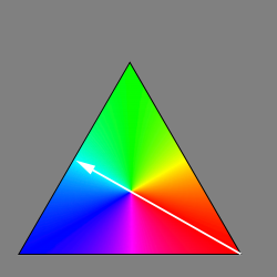
First here is the fully saturated triangle of colors showing the colors that are traversed going from red to cyan.
Hue-Triangle-and-arrow.png

Note that this indicates that it does not cross any other colors going from red to cyan (this is not the case for many other transitions in this triangle. The image below shows just the hue of the line and background that confirms there are not other colors in the transition:
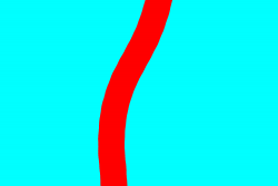
Hue-at-max-Sat.png


Following is the Color Triangle showing the actual color and saturation that the transition with traverse:
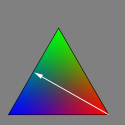
Transparecy-Transition.png

As you go from red to cyan the saturation goes to zero.
This too is confirmed by showing the saturation map of the line image. You can also see that when drawing the line the it is a series of dots formed by the brush settings that I used.
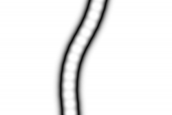


Saturation-goes-to-zero.png


The last and most important is the luminosity. Luminosity as the eye perceives it is best interpreted by the L channel in Lab space. So the triangle below shows the luminosity with a posterization filter so you can see the bands of luminiosity. Not that going from red to cyan drops in luminosity before it picks up again going over to Cyan. This is one of the key factors that you see of the "shadow."
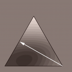
Contour-Map-of-Lab-Luminosity.png


And finally, here is the Lab Space luminosity of the line itself. Very clearly you can see the drop in luminosity in the transition:
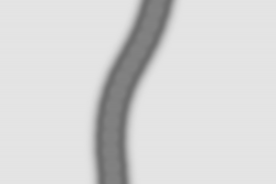
Line-Transistion-with-Lab-Luminosity.png

So depending on your starting and ending color your mileage may vary on how much shadow and how much alternate color content.

Bottom line, that is the way that PS does the partial transparency transition in RGB mode.

If you have a specific issue that is not caused by above (i.e. a different issue), I suggest you start another post since this thread is really focused on this partially transparent transistion.

Hope this helps
John Wheeler
 

iconca

Member
Messages
7
Likes
0
Ok. I did what you asked me and I do think I understand what you mean. I also came back to the file that started all this.

I tweaked shades and it helped a little. The shadowy "3D" effect (nr 2) was still there but I didn’t want to change colors of a whole design too much. So I took a second look on texts anti-aliasing. I flipped through options observing a letter “I” (also with Saturation Mask and than in a Lab Space). I didn’t noticed it before, but it is a little directional in some cases. So it could amplify whatever other weird issue I’m having . I didn't want to leave it with none, so I choose “strong “ since it looked as most evenly spaced. And that’s it for now. I finally confirmed that there really is other issue, than that with transparent pixels. I asked someone and we both see it, even on a file posted by you (last massage 3rd picture, where you said should be no transition). But I think it won’t show on canvas. Probably in a month I’ll see how it will look after printing. In a meantime I’ll read a bit about all topics you’ve mentioned. If there‘s some significant anomaly on a printed banner, I’ll try to ask a more specific question in a new post.

Again thank you for your answers and patience. I tend to get lost in my thoughts, so it helped to order them a bit : )
 

Top