
Photoshop Gurus Forum
Welcome to Photoshop Gurus forum. Register a free account today to become a member! It's completely free. Once signed in, you'll enjoy an ad-free experience and be able to participate on this site by adding your own topics and posts, as well as connect with other members through your own private inbox!
You are using an out of date browser. It may not display this or other websites correctly.
You should upgrade or use an alternative browser.
You should upgrade or use an alternative browser.
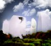
Welcome to Porcelain city
- Thread starter Tocca
- Start date

")

Tom Mann
Guru
- Messages
- 7,125
- Likes
- 4,312
Eek! Sorry.
Here are some nice examples of the Orton Effect:
http://www.google.com/imgres?um=1&h...bnh=179&tbnw=265&start=0&ndsp=26&tx=171&ty=94
http://www.google.com/imgres?um=1&h...nh=179&tbnw=241&start=26&ndsp=36&tx=109&ty=79
http://www.google.com/imgres?start=...page=5&tbnh=160&tbnw=202&ndsp=33&tx=140&ty=81
http://www.google.com/imgres?start=...&page=6&tbnh=173&tbnw=275&ndsp=27&tx=82&ty=99
http://www.google.com/imgres?start=...page=7&tbnh=168&tbnw=217&ndsp=34&tx=55&ty=126
http://www.google.com/imgres?start=...age=12&tbnh=179&tbnw=273&ndsp=34&tx=170&ty=74
T
Tom Mann
Guru
- Messages
- 7,125
- Likes
- 4,312
I was primarily thinking about at the inky diffuse shadows associated with each of the grassy mounds, the trees to the right of the man, etc.
IMHO, your image would have a better overall look if these areas were not so dark and not so soft-edged. In other words, if they looked more like realistic shadows and followed the outlines of the object casting the shadow more accurately.
OTOH, they are certainly have become a very popular feature to digital art in the last few years and everyone has their own likes and dislikes on such matters. I love shadows, just not quite so heavily and softly applied.
T
IMHO, you could


ibclare
Queen Bee
- Messages
- 9,890
- Likes
- 4,028
I think something between the two myself. But without the technical approach, only that of design sense, my conclusion is much the same as Tom's.
The way I see it is that the white architectural elements stand out too much, looking disconnected from the entire image and a lot of that is because of the deep shadow. I would personally put more shadow into the white, then tone down the shadow in the rest of the image, but not all of as I think it adds to the mystery to keep some, maybe vignette-like on the edges. But I would have to see that. I often have to try multiple effects to see if my mind's eye matches what I actually see.
Overall, I really like it. It's a fun concept and I like the 19th century style observer. I would like to see him closer to the front and larger. Not a lot larger as I imagine one of the ideas is to have him appear towered over by the majesty and mystery of the architecture in front of him.
Tom... yes, what I did is to weaken the orton effect at some places to regain the sharpness. But I see your point, I will try to tone the shadows a bit down to make the transition smoother.
clare....This exactly was the thought! The observer should look small in front of the big porcelain skyscrapers") Also another idea was to make the procelain "shine" over everything else in the picture, but i guess the contrast between the two is too strong.
Also another idea was to make the procelain "shine" over everything else in the picture, but i guess the contrast between the two is too strong.
Thank you two! I will have a next try when I find some time
clare....This exactly was the thought! The observer should look small in front of the big porcelain skyscrapers
Also another idea was to make the procelain "shine" over everything else in the picture, but i guess the contrast between the two is too strong. Thank you two! I will have a next try when I find some time
