Cindy Grundsten
Power User
- Messages
- 274
- Likes
- 137
Welcome to Photoshop Gurus forum. Register a free account today to become a member! It's completely free. Once signed in, you'll enjoy an ad-free experience and be able to participate on this site by adding your own topics and posts, as well as connect with other members through your own private inbox!
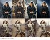
middle 2 on the top 1 not so good with loud backgrounds maybe blur it out more
and for the 2nd 1 I choose the 1 2nd along
Thats my choice
")
That's i think more depends on story you want to tell.
I vote for:
1.2 (from left to right) - I like most. Feels like 60-ies (would be more if cars in background would be older ones).
2.3 (from left to right) - Same thing. Nice oldies nostalgia.
And i like those colors. Warm and relaxing. Pleasant.
Others i don't "feel". And with those rails they look like she want to make suicide or something which can be their story but then they look to "happy" for that.
That's good, i was start to worry about her.Thank you!!! haha no she will not make suicide. Absolutly not
I must be psychic or somethingActually I had another version with an old car too, but I did not upload it.
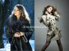
Which one of the two models shall I keep?
I always make several different versions, and then I can not choose. :banghead:
Originals below
Very nice work cindy , I see your masking/removing the background from the model is REALLY clean and effective , what method are you using to do this? I know there are many different ways, just wondering how you do yours
I noticed you have almost every stray hair extracted... fantastic!
The 2 with best harmony are (according to my own taste that is) nr 4 at the top row and no:1 at the second. Her legs (second row) are not in tune with the surrounding light and on row nr 1 it is both background and light in relation to the light in her hair that cause a bit disharmony. In nr4 & nr1 the harmony feels much better.
So, do all our opinions make it easier or harder to figure out?
I think the middle two in the top row appeal more because the model looks like she should be placed in an urban environment, with city lights. I'm leaning toward the street scene; its warmth and ambiance just seem to fit, though I like the other for its simpler background highlighting the model.
On the bottom row, the rightmost appeals to me. (But maybe that's just something I like about train tracks. My favorite shot of the eiffel tower is one i took from a train platform miles away.) I like this model best in the sepia tone and the subtlety of that in this picture. The other sepia is nice, just doesn't have as much of a story. In the leftmost image, the rocks seem almost like they are creeping up on her (ok, what kind of nightmare did that come from).
Those are my picks. Thanks for asking our opinions.
Which one of the two models shall I keep?
I always make several different versions, and then I can not choose. :banghead:
Originals below