What's new
Photoshop Gurus Forum

Welcome to Photoshop Gurus forum. Register a free account today to become a member! It's completely free. Once signed in, you'll enjoy an ad-free experience and be able to participate on this site by adding your own topics and posts, as well as connect with other members through your own private inbox!

Having huge problems with PS flattening all contrast... Where are my blacks?


Messages
12
Likes
2
Hi Guys

Pleasure to be here and hopefully get this answered

I’ve been reading online forums for over a week now trying to solve this problem and feel like I’ve tried everything so far. Here’s the issue:

I edit a photograph from a Camera Raw file to high contrast, grainy black and white, then when I try to flatten it or save it, it washes all the contrast out completely.

When I try to merge layers, flatten image or cmd+opt+e/cmd+opt+shift+e to a new file it does the same thing.

Here’s what I’ve tried to correct the issue:

I’ve tried saving it as a PSD file, a TIFF, a JPEG and a BMP file
I’ve tried calibrating my monitor (X-Rite i1 Pro)
I've tried soft proofing on and off (left off for now)
I’ve tried resetting my colour settings to import files into the working space as ProPhoto & Adobe RGB 1998
I’ve tried setting the import as the calibrated settings for the screen rather than ProPhoto or Adobe RGB 1998
I’ve checked that all files (apart from a Dodge/Burn Layer which has to be on Soft Light – never affected any files before) were set to normal
I’ve tried converting profiles from ProPhoto to Adobe 1998, Adobe 1998 to sRGB
I’ve tried going to preferences in User>Me>Library>Preferences>Adobe Photoshop CS6 Settings and manually resetting all relevant references
I’ve tried flushing and resetting all preferences
I’ve tried to uninstall and install Photoshop SC6 from scratch
And I've tried restarting the image from the raw file with the new install of CS6, done all the edits again manually...

And it still does the same thing.

Whenever I have adjustment layers on my file and have some contrast added that I want to save, it ‘flattens’ the whole image out

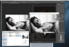
I've attached a couple screenshots to try and help explain, recording video wont work but may be a necessity if anyone needs it.

The last attachment is what it looks like in photoshop and another with my colour settings for the (calibrated) screen

Any Ideas? I’m racking my head trying to figure this out…

Thanks


Screen Shot 2013-12-10 at 16.50.10.pngScreen Shot 2013-12-10 at 16.51.36.pngScreen Shot 2013-12-10 at 16.59.31.png
 
Unless u post a copy of the raw data file, as well as the corresponding PSD and final flattened output file (jpg or whatever), any responses u receive will be just guesses.

T
 
@OP - if u are concerned about privacy or other such issues, you don't have to send us the whole file -- just crop it down to some small area that illustrates the problem.

T
 
Your RGB setting is set to ProPhoto in ACR.
Browsers and viewers can accurately display sRGB and Adobe RGB 1998, I could be wrong but I doubt they display ProPhoto RGB.
Save your JPG in sRGB or Adobe RGB 1998.

Also use PhotoPro in ACR only if the source actually is PhotoPro, otherwise there's no point in doing that.
 
Hi Tom and Steve, thanks a lot for you replies - much appreciated!

- Tom

No problem, happy to upload the files. Currently they're too heavy to attach to this post and since I'm new I cant post links yet. I assume thats to stop spam so if I were to post the link as an attachment hopefully thats ok - If not, since you're a moderator please feel free to delete whatever you feel is necessary. I've attached a photo of a link to wetransfer where theres three files

The original .CR2 (25.6mb), a layered .PSD (211.7mb) and an output JPEG (27.7mb) with an Adobe RGB 1998 profile embedded (theres also a picture in the attachments)

If theres anything else you need from me, fire away. Like I say to download large files just to help someone is a really nice thing to do. Thumbs up all round

- Steve

Thanks for the reply

Awesome avatar BTW

I actually switched to ProPhoto from Adobe RGB 1998 a few weeks ago since I shoot everything in RAW on my camera. I wanted to have the highest colour gamut from input to keep as much information in the file as possible and to be able to shrink it down for output afterwards.

I tried to save the file in sRGB JPEG as well as Adobe 1998 as well, but unfortunately it still does the same thing. If It helps I'm happy to switch back to Adobe RGB 1998 as input if you recommend?


Screen Shot 2013-12-11 at 10.09.58.pngScreen Shot 2013-12-11 at 14.38.23.png
 
@"Having" - Just to let you know, I'll definitely take a look at your files, but it won't be any earlier than around 11 PM East coast USA time tonight.

@Steve, re: "Also use PhotoPro in ACR only if the source actually is PhotoPro, otherwise there's no point in doing that."
- - - The source for ACR is raw files. Raw data files have no color space. The color space setting on the camera only imparts a color space to the in-camera jpg. However, there are important benefits to processing pix in a wide gamut space like ProFoto independent of the desired final output space. This is why Lightroom does all of its computations in a space very similar to ProFoto, and the user has absolutely no control over this.

re: "I could be wrong but I doubt they display ProPhoto RGB."
- - - This is good advice. About a year ago, I did a test on about a half dozen of the most popular browsers, and, as I recall, only one or two of them handled ProFoto correctly. The rest of them simply rendered them as if they were in sRGB.

Tom
 
I actually switched to ProPhoto from Adobe RGB 1998 a few weeks ago since I shoot everything in RAW on my camera. I wanted to have the highest colour gamut from input to keep as much information in the file as possible and to be able to shrink it down for output afterwards.

I tried to save the file in sRGB JPEG as well as Adobe 1998 as well, but unfortunately it still does the same thing. If It helps I'm happy to switch back to Adobe RGB 1998 as input if you recommend?

Having a larger gamut (bucket) is irrelevant if the Photo wasn't taken in that workspace.
sRGB is 16.7 million colors, Adobe RGB has about 22 million colors (rough guess), and PhotoPro is larger still.
If the image was shot as a JPG you max out at 16.7mill.

Opening it as an Adobe or PhotoPro RGB doesn't add more colors, you still have 16.7mil max.
On the other hand opening an image shot in Adobe RGB in a sRGB color space will strip out the additional colors, permanently.

As for using PhotoPro, Canon's EOS 1-D X, a $6,800 camera, only shoots sRGB and Adobe RGB.
Im not aware of any camera that uses PhotoPro.
My suggestion is shoot RAW and use Adobe RGB in the camera and open the image set to Adobe RGB in ACR.

Save it as a PSD or a Tif still using
Adobe RGB for print or archive.
For the web use sRGB or no color management.

For an experiment save your JPG with no color management and open that in you viewers and browser, foes it look OK now?
 
Hey Tom

Thanks very much man, appreciated.

-


Steve

No problem, I’ve changed to a working space of Adobe RGB 1998 for the meantime as per your recommendation and recorded a video for ease of seeing the problem.

It’s a rough draft of the kind of shot I want and the issue I’m experiencing.

I open up the CR2 in ACR as an 8 bit, Adobe RGB 1998 file. Process to how I like it with adjustment layers, then save three copies – one a JPEG with a colour space Adobe RGB 1998 embedded, another (converted from the previous) into sRGB and saved with the profile embedded, and another saved with no profile embedded. I then use preview to compare what I see in photoshop to the result I’m getting. Then paste them into my web browser like you recommended.

It seems the problem is still persisting…

It wont allow me to post links yet so I’ve put it as an attachment again –

Screen Shot 2013-12-12 at 04.05.08.png
 
Yup - welcome to my problem. The issue is they all look only slightly different from each other, but drastically so from what I'm seeing photoshop (calibrated monitor).

Do appreciate you trying, thanks Steve
 
I looked over your files, and the effect that you are seeing (probably all of it, although I didn't look carefully enough to rule out the possibility of some minor other effects) has absolutely nothing to do with color spaces.

Rather, it is due to an averaging phenomena that coincidentally, I just happened to describe in posts #3 and #5 in this recent thread: http://www.photoshopgurus.com/forum...es-up-when-document-saved.html#post1533667958.

You have a slightly different problem than the one discussed in that thread, but the same underlying mechanism is the root cause in both that case and yours. To see this for yourself, do the cmd-alt/opt-shift-e routine that you described in your very first post. As you know, this will put a flattened version of your file as a new layer on the top of your layer stack.

Next, set the screen magnification to something small like 16% and observer the image as you toggle the visibility of that top layer on and off. As you described, you'll see the problem that has been bothering you.

Next, continue to keep toggling the visibility of that top (composite) layer on and off as you work your way up in magnification to 25%, 33%, 50%, 66%, and 100%. What you will see is that as you increase the magnification, the change between "on" and "off", ie, the unwanted effect, becomes smaller and smaller, and at 100% is not present at all.

The reason for this is that at low magnifications, Photoshop has to average several of the original full resolution pixels to produce a single pixel for view at lower magnifications. For example, at 1/3rd (33%) magnification, PS has to average 9 of the original pixels to produce a single pixel for display at the lower magnification. When it does this averaging, even though the noise is randomly distributed in brightness from 0 to 255 in each of the original pixels, the new, lower-rez pixel will only vary in brightness by a much smaller amount because of this averaging. This is mathematically described by the "Central Limit Theorem" that I mentioned in the other thread.

So, the question is how to avoid this problem. The only true way to get around this phenomena is to make up separate versions of your image sized for each end use, and add the noise only after you have resized the base image to each of the desired final sizes (pixel dimensions).

For example, you might produce one version that is only 700 pixels on an edge for posting in this forum, another version that is a couple of thousand pixels on an edge to produce mid sized prints, and a full res version (5760 px on the long edge) to be used to make large prints.

There are some approaches that will kinda-sorta work around this issue, but they usually don't give the strong pixel noise that you seem to be seeking, so I'm not even going to discuss them.

HTH,

Tom

PS - As a side note, exactly the same problem arises when you want to add a simulated texture (eg, canvas, paper, etc.) to an image, and to be sure you wind up with the same amount of texture that you see on your screen, you have to add the texture at the very end, after the image has been sized for a particular use.
 
Last edited:
You are a genius.

I’ve been away from the computer for a few days and it was so nice to come back to find an exact explanation of what the problem was. You were right Tom – I tried zooming at various different points into the original and cmd/alt/opt/e’d version, and right around 66% the image changed in front of my eyes to that lower contrast one. Guess I have my excuse for a 4K screen ;)

Standard images, without noise, look fine saved and stacked next to each other. It’s nice to know photoshop hasn’t got a glitch - yet I’m still a little confused as to how to get it working…

Even when I add noise to the resized images last, that itself flattens contrast. Maybe I’m doing something wrong? I then have to Levels up the black point again, or give more contrast manually to get what I want, and then the same situation happens again.

Somehow I managed to get it working before the issue started happening. I’ve attached a screenshot, and uploaded that file too, just incase it helps. Untitled-2new.jpg was a save from the original ‘Jamie Baker 0372 new.tif file – they both look just like I want them to.

View attachment 40246

Here’s a video of me applying your advice in case I’m doing something wrong. I open the original, take off the grain layer, copy merged to a new file (same size), add grain – which then flattens it... I try to correct with levels, yet flattening again does the same as above. Any way to have the contrast stay as is when applying noise?

[video]http://youtu.be/**O7zK-JGr8[/video]


For my work as a photographer, this grainy high contrast black and white (with subject matter of course) is a key part of my ‘look’. You’re being a great help so far Tom. Is there anything you can recommend I try so I can post back here with my results?
 
Hi "Having" - I just saw your most recent post. Thanks for such high praise, but it's more due to experience than smarts, having worked with PS since the 1990's.

I'm in the middle of something else, but I'll have a look at your latest attachment and video in the next few hours and see if I can figure out what you described in your latest post.

Best regards,

Tom
 
Hi "Having" - The link to your u-tube video doesn't work. Nor did it work after I tried to repair the obvious problem with the domain name.

Tom
 
Hi again, "HavingProblems" -

Well, in this case, *I'm* the one having problems. The link (actually links) to your youtube video still doesn't work so I don't know with certainty exactly what you are doing. About the only help I can offer at this point is to give you my guess at what I think may be causing the loss of contrast when you add noise.

Like before, I'm going to start by asking you to do a little educational experiment. Make a new PS document: RGB, 8 or 16 bpc, small (say, around 500 pixels on each side). It doesn't matter what color you select for the background layer. Make sure you can see the histogram of the image. Begin by making a new layer and filling it with a mid-gray, say, (130, 130, 130). You should see a single central spike in the histogram.

Then, start adding uniformly distributed monochromatic noise to that layer. Start with a small amount, say 10%. You will see the central spike broaden into a band of values that extend from 130 minus 13 to 130 plus 13 (note, 13 = 10% of 130).

Try it again, except this time add 20% of the same type of noise. This time, the band in the histogram will extend from 130 minus 26 to 130 plus 26.

Repeat all of the above a couple more times, starting with a black layer, and again, starting with a pure white layer.

What you have done is perform a little experiment that tells you exactly how Photoshop's "add noise" function works: Basically when the user adds noise, it takes the value of every pixel and randomly adds or subtracts random numbers (with a specified maximum amount) from the brightness of each pixel. Obviously, no matter how much noise you try to add, the final pixel values can't go below zero or above 255.

If my guess about your workflow is correct, the above experiments are telling you precisely why you lose contrast when you add noise. From what I saw in the one PSD file of yours that I have, it looks like you like to add large amounts of noise using the "amount" setting in the "add noise" dialog box. What this means is that you are modifying the pre-noise pixel values by such large amounts that their pre-noise value hardly matters once such large amounts of noise is added. In other words the original image gets washed out.

Why don't you confirm this by repeating the above experiment except add the noise in increasing amounts to a real B&W photo, not a screen filled with black, gray or white.

If it looks like I guessed correctly at your workflow and this is indeed the cause of your loss of contrast, let me know and we'll move on to figure out ways to work around this problem.

Cheers,

Tom
 
Hi again, "HavingProblems" -

Well, in this case, *I'm* the one having problems.

Haaa, I see what you did there...

I read through your post today and it seems like once again it's going to be helpful. I just got off an 16 hour shift so am knackered, but wanted to keep you in the loop that first thing tomorrow morning I'm going to apply the advice and record the video. Apologies for the links not working previously, even the second one which I re-uploaded doesn't seem to work for me either - something I'll take care of in the morning as well.

Please don't trouble yourself to reply, I'm sure you're just as busy and have lots else on your mind as well. Lets chat tomorrow

Thanks again Tom

-George

The link (actually links) to your youtube video still doesn't work so I don't know with certainty exactly what you are doing. About the only help I can offer at this point is to give you my guess at what I think may be causing the loss of contrast when you add noise.

Like before, I'm going to start by asking you to do a little educational experiment. Make a new PS document: RGB, 8 or 16 bpc, small (say, around 500 pixels on each side). It doesn't matter what color you select for the background layer. Make sure you can see the histogram of the image. Begin by making a new layer and filling it with a mid-gray, say, (130, 130, 130). You should see a single central spike in the histogram.

Then, start adding uniformly distributed monochromatic noise to that layer. Start with a small amount, say 10%. You will see the central spike broaden into a band of values that extend from 130 minus 13 to 130 plus 13 (note, 13 = 10% of 130).

Try it again, except this time add 20% of the same type of noise. This time, the band in the histogram will extend from 130 minus 26 to 130 plus 26.

Repeat all of the above a couple more times, starting with a black layer, and again, starting with a pure white layer.

What you have done is perform a little experiment that tells you exactly how Photoshop's "add noise" function works: Basically when the user adds noise, it takes the value of every pixel and randomly adds or subtracts random numbers (with a specified maximum amount) from the brightness of each pixel. Obviously, no matter how much noise you try to add, the final pixel values can't go below zero or above 255.

If my guess about your workflow is correct, the above experiments are telling you precisely why you lose contrast when you add noise. From what I saw in the one PSD file of yours that I have, it looks like you like to add large amounts of noise using the "amount" setting in the "add noise" dialog box. What this means is that you are modifying the pre-noise pixel values by such large amounts that their pre-noise value hardly matters once such large amounts of noise is added. In other words the original image gets washed out.

Why don't you confirm this by repeating the above experiment except add the noise in increasing amounts to a real B&W photo, not a screen filled with black, gray or white.

If it looks like I guessed correctly at your workflow and this is indeed the cause of your loss of contrast, let me know and we'll move on to figure out ways to work around this problem.

Cheers,

Tom
 

Back
Top