What's new
Photoshop Gurus Forum

Welcome to Photoshop Gurus forum. Register a free account today to become a member! It's completely free. Once signed in, you'll enjoy an ad-free experience and be able to participate on this site by adding your own topics and posts, as well as connect with other members through your own private inbox!

bending objects


very nice, havent known that "CTRL+SHIFT+ALT + T part" until now. and your are not bad in writing tuts, i could follow without problems :}


thx for that tutorial
 
Nice stuff Nitrobutler. I can offer another alternative, where you'll not have to worry about finding the centre. You can also use it to save it as an action to re-use at a later time as a dial creator too.

For this method we make use of some brush settings and the simple circular path.

First, create a custom brush in the shape of whatever you want as your dial - in our case, a rectangle. Then you can save that as a brush via "Edit --> Define brush".

Next, we change the brush settings on the brush palette. First, we remove the spacing setting in the brush tip menu. This then allows us to stroke only the anchor points of a specific path. Secondly, on the shape dynamics, we change the Angle control to "Direction".

Now, take the shape tool and create a circular path to the size of your dial. Then simply right click on the path, and select "stroke path" from the context menu. This will then stroke the four anchor points on the path. To move to another angle, simply hit (gently) CTRL+T or command+T to bring up the Free Transform selections. Keep holding the Shift button to allow a controlled rotation and rotate the path - or enter the degrees in the provided boxes. Then just stroke it again - you can alter the size of the brush for smaller notches, obviously. You can use the Shift+Ctrl+T command to repeat the transformation, as Nitro stated.

Ok, I did not offer a shorter explanation, but it's a useful technique nonetheless I reckon.
 
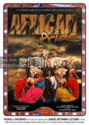
It's a really good layout, but needs Color Management.
The bluish red tones of the giraffe border do not get along with the warm golds of the lettering, nor the general color scheme of the performers.

If you can tweak the tones of the background and lettering to better accentuate and compliment the performers and their costumes, I think the overall effect will be much more dramatic.
At the very least, you should adjust the giraffe border to eliminate the reddish tone...
 
MsOz said:
It's a really good layout, but needs Color Management.
The bluish red tones of the giraffe border do not get along with the warm golds of the lettering, nor the general color scheme of the performers.

If you can tweak the tones of the background and lettering to better accentuate and compliment the performers and their costumes, I think the overall effect will be much more dramatic.
At the very least, you should adjust the giraffe border to eliminate the reddish tone...

I like what youv'e suggested, however, I did like the contrast in colour. The job has gone to print, otherwise I might have considered changing it.

cheers !
 

Back
Top