What's new
Photoshop Gurus Forum

Welcome to Photoshop Gurus forum. Register a free account today to become a member! It's completely free. Once signed in, you'll enjoy an ad-free experience and be able to participate on this site by adding your own topics and posts, as well as connect with other members through your own private inbox!

Help with this Banner Design


Lenny Juliano

Member
Messages
6
Likes
1
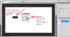
What can I do to improve this picture? Does the pic of me look like it wasn't shot with the background? If so, how do I edit my picture to match the background? And I need way better ideas for the text. Any help?
Buy the EP banner.jpg
 
LOL @Lenny, when you respond to your own post, it essentially moves your topic to the top of the list of most recent topics. About your picture, I don't see anything wrong with it. Actually the out of focus aspect of the ocean in the background is exactly right as that is how landscape shots would be captured. As far as the text goes, the only thing I can suggest is to maybe adjust the tracking between the letters. Provided you have the source file with the layers still intact, here's what you can do.

Open the file in Ps, and select the Text tool. Keyboard shortcut is the T key (T).

For each text layer you have, select all the text with the Text tool one layer at a time and open the Character window. (Click on Window>Character).

The tracking option is on the right hand side of the Character panel and is represented with an A V and a two sided arrow going in opposite horizontal directions.

You can drag to the left or right on the icon to adjust the tracking. Dragging to the left brings the letters closer, to the right makes them further apart.
 

Attachments

  • LennysTutorialScreenshot.jpg
    LennysTutorialScreenshot.jpg
    398.8 KB · Views: 3
A bump after 13 minutes? :bustagut: Not much of a bump especially when it was justified. I like the spacing much better in the second post. I know you had too few posts to edit your entry so you had to make a second post. No worries Lenny. It's cool.

Nice CD cover by the way.

What do you think is wrong with the text?

As for the other aspects ... You portrait strikes me as being just a little too large. Too close to the top and maybe a bit overwhelming (even if it is a sexy stare). You and the BG fit together OK. I just question the brightness behind you. It is obviously a reflection of the CD, but the whiteness all the way up to the edge throws off the balance. If the shadowy vignette were larger it would feel more anchored to me, not floating off the page. This of course is just my opinion and I would wait for others and consider your own aesthetics before you make any changes.
 
I think the picture looks fine as it is...

The only thing wrong with the text is that drop shadow you've used on the "Lenny Juliano" Text. Loss it and have that text exactly as it is on the cd cover. And looking again, the "-EP-" text looks fuzzy, maybe fix that.
 
I think the picture looks fine as it is...

The only thing wrong with the text is that drop shadow you've used on the "Lenny Juliano" Text. Loss it and have that text exactly as it is on the cd cover. And looking again, the "-EP-" text looks fuzzy, maybe fix that.

What's "wrong" with that drop shadow? With the light source in the upper right and the drop shadows going to the lower left, I think it makes sense to have them.
 
Because it's the only piece of text that has the drop shadow and I personally feel it sticks out like a sore thumb.
 
Ok, you're not a fan of drop shadows in this case. But that doesn't necessarily mean there's something "wrong" with his image. The truth is that there's nothing "wrong" with it. It's his work and if there's something again "wrong" with it, he'll discover it.
 
In his topic he clearly stated that he needed help with the text...

The first thing that I noticed with the text was the drop shadow, and to me, it just looks out of place and doesn't fit the rest of the text.
 

Back
Top