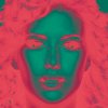
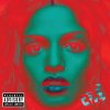
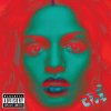
1) To check if my comment that direction and quality of the lighting plays an important role in the difference between the starting image I used and the one used for the OP's image, one can more or less invert these two gradient mapped images to get an idea of what the OP's original looked like. Basically, one just inverts the gradient mapped version and then applies a BW conversion to it as shown in the screen grab immediately below:

It's immediately apparent that the image I started from has much more diffuse, frontal lighting, a broader tonal range, etc., whereas the image they started from has most of the light coming from directly in front of, and well above the model. This leads to deep shadows in the eye sockets, under the nose, under the lips, etc. When this is converted to color, it leads to more red in these areas.
----------
2) Another way to see the effect of lighting is to compare the effect of the same gradient map on two images, one with harsh light coming from above, and the other using a fill light to fill in the shadow areas:

courtesy:
http://www.cambridgeincolour.com/tutorials/portrait-fill-light.htm

Again, as you can see the total area in red has increased because of the increase in shadow areas.
------------
3) When you are trying to match someone else's work, another good parameter to adjust is using a B&W conversion adjustment layer before the gradient map is applied. This forces the gradient map algorithm to use your B&W conversion, not its own internal B&W conversion. Below is an animated GIF I put together where each frame is one of the standard B&W conversion options (eg, default, blue, high contrast blue, red, IR, lighter, maximum_black, maximum_white, etc.):

--------------
4) As I said earlier, the grain / noise structure in the cited image is so dependent on the ISO used, digital vs film capture, what sensor or film was used, the degree of magnification, etc.. trying to simulate it accurately is a bit of a crap-shoot, but here's a quick attempt. I also toned down the reds in this version to better match the OP's goal.

Obviously, if one had the time or interest one could do even better than this, especially in regard to actually attempting to simulate the lighting in the original using dodging and burning on my original, before beginning any other processing steps.
--------------
5) Finally, my guess is that the blue lips seen in post #2 in this thread probably were done by some fairly brute force method such as painting some blue over them, or using a hue/sat adjustment layer masked to operate just on them. I think it would take too much diddling around to successfully introduce a third color (blue) into the existing cyan/red gradient map. I was getting tired of working on this image, so I didn't even bother to play with this aspect.
Cheers,
Tom


