What's new
Photoshop Gurus Forum

Welcome to Photoshop Gurus forum. Register a free account today to become a member! It's completely free. Once signed in, you'll enjoy an ad-free experience and be able to participate on this site by adding your own topics and posts, as well as connect with other members through your own private inbox!

My First Time Using Photoshop


A-Way

Member
Messages
23
Likes
0
Hi everyone,

This is my first time using Photoshop...ever.
I'm a little nervous to share but I would love some feedback.
I'm not completely happy with it but I'm not sure why/how/what to do with it.
I'm still learning all of the tools.

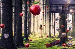
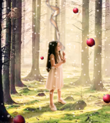
I made this just for fun for my kids after having a dream about The Giving Tree.

Thank you in advance. :)

Click to expand.
The Giving Tree.jpg
 

Attachments

  • The Giving Tree.psd
    13 MB · Views: 8
Hi and welcome to the forum.

I like it, and I think it's extremely impressive for a first attempt. Certainly way better than my first attempt. Photoshop can be so overwhelming at first that it's hard to know where to begin, so just keep at it.

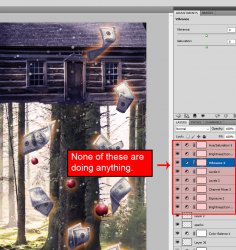
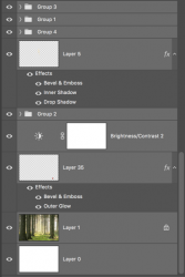
I looked at your PSD file and something is puzzling me. Throughout your layers panel, you seem to have about two dozen adjustment layers of various types (Levels, Vibrance, Hue/Saturation, Brightness, etc.) but none of them are doing anything. For example, in the screenshot below, none of the top eight layers are doing anything, meaning that you did not touch any of the default settings of these adjustments. Is there a purpose for why all these layers are here?


Screenshot.jpg
 
I think this is a very good piece! I love the concept! Other than some major lighting issues, all in all a great first attempt!

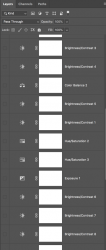
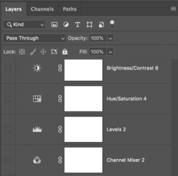
Quick note: As Rich noted, I also found 26 adjustment layers that were not doing anything.

Screen Shot 2020-07-12 at 9.43.21 PM.png

Screen Shot 2020-07-12 at 9.43.50 PM.png
Screen Shot 2020-07-12 at 9.44.13 PM.png

I grouped all the "working layers".
Screen Shot 2020-07-12 at 9.44.32 PM.png
 
@IamSam @Rich54
Thank you so much for the kind, thoughtful, and detailed feedback. I think those layers were used for each apple... I’m not sure what’s going on there.. lol :confused:

When I clicked on the apples to make some edits I noticed the layers. Were they there once added to the file or once edited? What is the correct way to fix it?

As for the lighting, I notice the issue but still trying to learn how to fix it. Any tips?

Thanks again!
 
I did find one Photo Filter adjustment layer that was having some affect. So only 25 adjustment layers that were not affecting anything.

I think those layers were used for each apple... I’m not sure what’s going on there.. lol
I think this was your intention but you did not remember to clip the adjustment layers to the individual apples via a clipping mask.

When I clicked on the apples to make some edits I noticed the layers.
Not sure what layers you mean..........the adjustment layers?
Were they there once added to the file or once edited?
Only you know that. I can only guess that you intended to adjust the apples and did not clip the adjustment layers to the apple layer. You may have then copied/duplicated the layers for each apple.
What is the correct way to fix it?
Depends on what you need fixed. I'm not sure what your intent was for the adjustment layers.

As for the lighting, I notice the issue but still trying to learn how to fix it. Any tips?
Lighting is the largest problem for beginners. The lighting of the entire contents of the composite will be based on the lighting of the background.

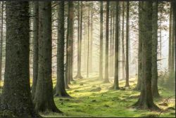
You have to examine the background image to determine where the primary light source is located.
Screen Shot 2020-07-13 at 1.57.37 AM.png

These two trees on the right side of this screenshot show that a strong light source is behind and to the right. Back lighting.
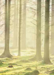
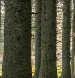
Screen Shot 2020-07-13 at 2.00.42 AM.png

However, the trees on the far left indicate a secondary light source based on the highlight and shadows of their trunks coming from the left.
Screen Shot 2020-07-13 at 2.03.21 AM.png

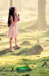
I probably would turn the little girl around and give her a shadow.
Screen Shot 2020-07-13 at 2.16.50 AM.png

The lighting on the apples and money are all off................but it actually works with this comp. It's consistent with a dream state.
The lighting of the canoe is off, but the cabin in the tree is the most noticeable, it's receiving light from the front and the upper right hand side.

Lighting (Highlights) on this thing is off....
Screen Shot 2020-07-13 at 2.35.49 AM.png

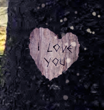
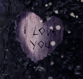
Lastly, the shadowing and shading of the tree damage needs some help.
Screen Shot 2020-07-13 at 2.23.44 AM.png
Screen Shot 2020-07-13 at 2.30.47 AM.png
 
I did find one Photo Filter adjustment layer that was having some affect. So only 25 adjustment layers that were not affecting anything.


I think this was your intention but you did not remember to clip the adjustment layers to the individual apples via a clipping mask.


Not sure what layers you mean..........the adjustment layers?

Only you know that. I can only guess that you intended to adjust the apples and did not clip the adjustment layers to the apple layer. You may have then copied/duplicated the layers for each apple.

Depends on what you need fixed. I'm not sure what your intent was for the adjustment layers.


Lighting is the largest problem for beginners. The lighting of the entire contents of the composite will be based on the lighting of the background.

You have to examine the background image to determine where the primary light source is located.
View attachment 113758

These two trees on the right side of this screenshot show that a strong light source is behind and to the right. Back lighting.
View attachment 113759

However, the trees on the far left indicate a secondary light source based on the highlight and shadows of their trunks coming from the left.
View attachment 113760

I probably would turn the little girl around and give her a shadow.
View attachment 113761

The lighting on the apples and money are all off................but it actually works with this comp. It's consistent with a dream state.
The lighting of the canoe is off, but the cabin in the tree is the most noticeable, it's receiving light from the front and the upper right hand side.

Lighting (Highlights) on this thing is off....
View attachment 113767

Lastly, the shadowing and shading of the tree damage needs some help.
View attachment 113762
View attachment 113766
Thank you! I’m going to take your notes and once I get a chance to work on it, I will post my progress. I’m sure there will be more to fix but hopefully I can improve it little by little.
 
Really good first attempt!! as the mayor things already been pointed out I will only say my personal opinion in a couple of things.

First of all I would make the canoe bigger but hide half of it behind the threes.
For me, the dollars take away a little bit the magic of the forest (personal opinion)

Really good job! Keep working on it!
Thank you so much!
I will include your suggestions in my notes when I make the changes. I initially thought the same thing about the dollars. I wanted to reflect that part of the story but I’m not really loving it either.

any suggestions? I thought of some gold coins on the ground but the story is all about resources given from the tree (paper money)... although, it is a dream state?

I could also consider making the money tiny or simply putting a few dollars on the ground. Any suggestions would be greatly appreciated! :)
 
Coins sound good, but if the dollar has meaning you also can try to find the way to make it work, for example, I would try the same you did with the apples... different sizes and locations so the dollars don't overpower all the image and become a distraction, something more subtle like if they were falling leaves...
 
Coins sound good, but if the dollar has meaning you also can try to find the way to make it work, for example, I would try the same you did with the apples... different sizes and locations so the dollars don't overpower all the image and become a distraction, something more subtle like if they were falling leaves...
Great suggestion! Thanks so much.
 
Hello,

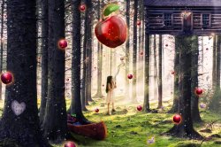
I tried my best to take the suggestions here and make changes. I'm still trying to fix lighting but it is a work in progress.
I was not able to move part of the boat behind the trees (I will work on trying to learn this) but I tried to move it around a bit while making it bigger.
I turned girl around and added some lighting from the front and a shadow behind.
I was not able to fix the lighting on the house but I think it may look a bit better due to the other lighting I added.
Money was moved around and made smaller.

Also- I will be sorting through the layers to get rid of anything that serves no purpose (still working on that as well)

Clearly, I have a lot to learn but I'm enjoying it!

Suggestions & comments are appreciated :)

Thank you
 

Attachments

  • The Giving Tree NEW EDIT.psd
    13.2 MB · Views: 6
Here's a (hopefully) helpful tip you may not know. You can sometimes get lost in a file with this many layers. It helps to organize things by creating Layer Groups, which are folders that can be collapsed or expanded. For example, your image has about 20 individual apple layers, so all of these can be grouped into one Layer Group, which will make your file easier to navigate.

It's very easy. Here's a tutorial:

 
Nice! money definitely better in my opinion, now I saw your psd one important thing it's a little bit of organization, one simple thing you should do its select all the layers of apples for example and click control+g, that creates a folder with all the layers selected, you name the folder apple for example and it would be a lot easier to find a fix any layers.

About the canoe, its really simple on the layer of the canoe create a mask layer and erase the part where the three goes, create some shadows and its ready XD


The light its always more complicated, creating shadows as well... for example in this case, the main light comes directly from the upper right but it's not the its not the only one, you can see it on the painting as well like the artist also added light on the left side of the threes, basically being the sky its a big light, that goes a little bit everywhere, so the shadow would be harder close to the girl but it would banish at distance...

Sorry for my english is not the best for this kind of explanation i made a fast visual example just in case..

The Giving Tree NEW EDITff.jpg
 
Here's a (hopefully) helpful tip you may not know. You can sometimes get lost in a file with this many layers. It helps to organize things by creating Layer Groups, which are folders that can be collapsed or expanded. For example, your image has about 20 individual apple layers, so all of these can be grouped into one Layer Group, which will make your file easier to navigate.

It's very easy. Here's a tutorial:

Thank you very much! This is indeed helpful. :)
 
Nice! money definitely better in my opinion, now I saw your psd one important thing it's a little bit of organization, one simple thing you should do its select all the layers of apples for example and click control+g, that creates a folder with all the layers selected, you name the folder apple for example and it would be a lot easier to find a fix any layers.

About the canoe, its really simple on the layer of the canoe create a mask layer and erase the part where the three goes, create some shadows and its ready XD


The light its always more complicated, creating shadows as well... for example in this case, the main light comes directly from the upper right but it's not the its not the only one, you can see it on the painting as well like the artist also added light on the left side of the threes, basically being the sky its a big light, that goes a little bit everywhere, so the shadow would be harder close to the girl but it would banish at distance...

Sorry for my english is not the best for this kind of explanation i made a fast visual example just in case..

View attachment 113947

Thank you very much! I appreciate the comments and the example.

Your English is great and I understand what you are saying. :)
 
Looks great!

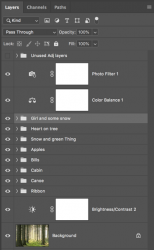
I thought about it but failed to mention this after your first post, but I certainly agree that you could use some organization. Here is what I did with the first PSD file you uploaded right after I opened it...............but I have some degree of OCD! LOL!!!

Screen Shot 2020-07-20 at 5.17.00 PM.png

As for the changes, I think they look great. The lighting on the canoe has been addressed already. The only other thing I can think of for improvements would be to correct some perspective issues. BUT...............I like the dream concept of the composition and I feel that it's supposed to be surreal. I would not make perspective changes in fear that you might dislodge it from the dream state.

At least for me, I like how it looks now with the re-positioned canoe. I have no idea what the green thing is or what it represents. You may want to leave it as is with the canoe covering it up, or you may want to place it somewhere else. I might reposition it and lay it on the ground in proper lighting.

Screen Shot 2020-07-20 at 5.31.33 PM.png
 
Looks great!

I thought about it but failed to mention this after your first post, but I certainly agree that you could use some organization. Here is what I did with the first PSD file you uploaded right after I opened it...............but I have some degree of OCD! LOL!!!

View attachment 113949

As for the changes, I think they look great. The lighting on the canoe has been addressed already. The only other thing I can think of for improvements would be to correct some perspective issues. BUT...............I like the dream concept of the composition and I feel that it's supposed to be surreal. I would not make perspective changes in fear that you might dislodge it from the dream state.

At least for me, I like how it looks now with the re-positioned canoe. I have no idea what the green thing is or what it represents. You may want to leave it as is with the canoe covering it up, or you may want to place it somewhere else. I might reposition it and lay it on the ground in proper lighting.

View attachment 113953
I love the way you organized everything. I am very organized in real life so now I know how to apply it here! Lol

The green item is the book.. The Giving Tree :)

I like the look here or I can possibly move it around to try some different ideas.

Thank you so much!
 
I was hoping to get some thoughts on the big apple. Does anyone else feel that it gets in the way? I thought it looked dreamy but now I feel it gets in the way. I'm thinking of putting flowers in her hand instead... or somehow making the apple look more like a balloon (no clue how I would do that)...
 
When I look at any composition/image, I always try to notice what catches my eye first. In your comp, it was initially any of the primary objects that were not consistent with the main background. Primary objects are those that would be (reasonably) occurring in the main background. The previously mentioned lighting differences with the girl was the first thing I noticed. This was changed.

In your next example, the canoe (1rst) and the cabin (2nd) were what was catching my attention. But after @Argos moved the canoe, this left the cabin. The cabin I can live with as it could be considered transitional...........it's not necessarily a primary object since it's hovering in the air. Secondary objects that would not be consistent with the background can have rules that only apply to them. So the lighting doesn't bother me with those. They're part of the dreamscape.

In addressing your question, I truly apologize and I must be losing it because I had no idea that the large apple was intended to be balloon-like!!!! I thought the big apple was just closer to the viewer as it stands to reason that objects closer to the viewing point (foreground), are larger and blurry. Objects in the middle ground should be in focus and objects farther away (background) would again be growing blurry. This is referring to focal point. I did not realize it was supposed to be a balloon!

Let's see if we can come up with an idea that would make the large apple more balloon -like.
 

Back
Top