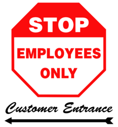
Thank you for taking the time to read this! I work as a cashier at a gas station and we have a glass door on the side of the kiosk that is intended for employees. This door is always locked as it opens into our register/backstock area. Customers must always use the front door. We have a some what crude sign that was made on Word by a former employee.
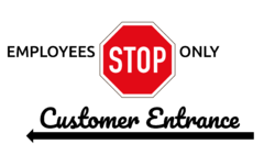
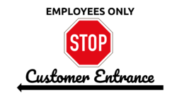
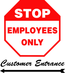
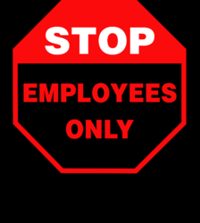
The glass area is approx. 24 inches wide (I will measure it later). What I want is an image that can be printed on a good quality machine. I want to use the STOP sign image that is attached to this thread. To the left of S should read EMPLOYEES and ONLY to the right of P. The background should be white and the letters black. I am open to suggestions as to the font; I was thinking Bahnschrift SemiBold or something similar.
Under the Employees Only graphic we want "Customer Entrance" with a straight arrow facing to the left (under the C) to indicate the proper door to use. We would like the font to be cursive, friendly, and legible.
Please let me know if you need further details and thanks again.
