What's new
Photoshop Gurus Forum

Welcome to Photoshop Gurus forum. Register a free account today to become a member! It's completely free. Once signed in, you'll enjoy an ad-free experience and be able to participate on this site by adding your own topics and posts, as well as connect with other members through your own private inbox!

cgi/game photo look?


Messages
9
Likes
3
I'm looking for a way to do a particular look, or a combine a couple actually.

One is the sculpted cartoony look, but one that doesn't introduce or corrects for a lot of the blacks that tend to end up in a photo by dodging and burning. Also preferably that keeps and controls a lot of detail, and doesn't add a lot of noise such as the arun vids youtube or psdbox methods which completely tweak pixels running them through colorefex or other filters like them, and never mention any way to control the noise in the images.

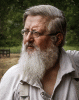
The other main one I'm interested in is the cgi look. It makes people and objects in photos look like they're out of a 3d game, and illustrative as seen here:

cgiafter.jpg


He doesn't seem to push the effect very much, and his other free tutorials don't give me the confidence that he's not going to just tell me to play around with unsharp mask or a high pass layer or something, so not going to drop $30 to find out.

Anyone know any free tutorials or a step by step that could help me with these effects? I'm not interested so much in the compositing aspect mind you of this, I'm looking for something I can apply to photos I'm happy with and just want the effect.


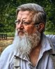
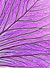
Also this is one of the references I was looking at. I'm sure I've seen tutorials on something like this one in particular before, but can't remember the steps exactly.

www.photoshopgurus.com.jpeg


also here:

21604302480_3972533f8e_b.jpg


Thanks for any help!
 
Last edited by a moderator:

Tom Mann

Guru
Messages
7,223
Likes
4,343
Image #1 - 90% of what you see was obtained by hiring a pro photographer who has the right lens, ie, something like a fast (f/2.8), long (300 mm or more) lens, and lots of pro lighting equipment (eg, studio strobes plus modifiers like gridded softboxes, snoots, flags, a blue gel, etc.) and knows his trade. The only areas that look like they might have been touched up in PS are the areas with the blue cast.

Image #2 - Read through THIS THREAD, and especially the links contained therein. As in the 1st image, it all starts with appropriate lighting. You are not going to get this look by starting with a cell phone camera, or even a DSLR with a hot-shoe flash.

Image #3 - I see so many different fx and PS techniques in this image, I don't know where to start. Can you be more specific about which aspect of it interests you.

Tom M
 

Tom Mann

Guru
Messages
7,223
Likes
4,343
FWIW, IMHO, probably the quickest way to get in the ballpark of what you are looking for is to use Topaz Detail. The edit seen in the attached animated GIF probably took me under 1 minute to do. It took me more time to make the animated GIF and write this post than it did to generate the effect. Obviously, with more effort (eg, starting with an image closer to your example (taken with studio, not natural lighting), some preliminary smoothing, some manual burning and dodging, etc.) one could get much closer.

HTH,

Tom M

PS - Original image courtesy of L. Milluzo.
 

Attachments

  • D7C_1813_raw-LR_to_PSD_proFoto-ps03a-698px_wide-sRGB-for_GIF.gif
    D7C_1813_raw-LR_to_PSD_proFoto-ps03a-698px_wide-sRGB-for_GIF.gif
    317.8 KB · Views: 40
Messages
9
Likes
3
This page shows what I'm after, also the "rossi effect" I thought i had given the link before but all that shows is the end image.

before-after.jpg

This is a detail sharpening effect that I'm after. It's all in post. The original photos that were taken look nothing like them. Topaz detail works, but not very effectively, the noise it generates is rather high. Please show me a tutorial then on the settings you used to push that example, and what it looks like at 100%. Using topaz detail alone will not cut it in my experience. What other programs are out there like topaz that modulate and control detail to the extent you can push images to make them look like cgi characters, or what base techniques in photoshop can be used as Rossi seems to be using? None of what is shown results really to the point of what the star lord image is.

I've tried I think every program which is a simple search to do this effect they just dont end up with very high quality results. Most of them end up pushing the colors of an image too much so that the saturation values are off, so that too much crushed black ends up in the final result, especially for flesh tones, it just does not look correct. Also the highly illustrative style just never ends up with high detail in my experience even with an extra highpass layer. Some other trick is being used that I just can't achieve.

What's the basic theory behind what's happening in topaz detail?

I've shot images in studio that I want to apply these effects to and I know I have the lights set to produce this dramatic effect, but the post methods I've been able to achieve are unsatisfactory to me. I've been after this look for years now and so please consider that in your response. It's difficult for me to convey all the work i've done on achieving these photo illustration effects. I really want to be able to push it and end up with a very high pro looking result.

The biggest concern for me is hair. I don't really have good examples posted, but a lot of these images end up with a very nice sculpted detailed hair, where most topaz detail methods overwork the hair or destroy the detail in the hair, and the effect just doesn't work in already highly detailed sections. Something else is going on there, it's not just a simple masking out.

This is the example I used in my dpr thread of the hair and skintone detail I want to achieve.

www.photoshopgurus.com.jpeg
 
Last edited by a moderator:

Tom Mann

Guru
Messages
7,223
Likes
4,343
Some thoughts and questions:

1) OP: "...This is the example I used in my dpr thread...". - What is "dpr"? digitalphotoshopretouching.com, digitalphotographyreview.com, or something else? Referring to your previous work in this area is great, but it's useless to people unless you provide a real, clickable link. Nobody is going to try to figure out what you means.

2) OP: "...Most of them end up pushing the colors of an image too much so that the saturation values are off, so that too much crushed black ends up in the final result, especially for flesh tones..." - Unfortunately your statement is true even for simple, native PS tools like, "Levels". Push the middle slider of the "levels" control to the right, and the image gets both darker (which may be what you want), but more saturated than you want (the unwanted side effect). Almost every PS tool will have some unintended consequences, and if you can't find a tool where you can tolerate the unintended side effects it introduces, you've got to learn how to deal with them. For example, to fix the increase in saturation in my "Levels" example, If masking isn't an option, another option is to simply make two identical copies of the "Levels" adjustment layer, set one to "luminosity" and one to "color" blend mode, and adjust the opacity of the color blend layer to get the amount of saturation change that you like. With respect to the very common "crushed blacks" problem, just use the "Blend_If" adjustments, split the sliders (particularly, the black slider), and once again, adjust the amount of effect on the deep blacks to taste. If that's not a fine enough adjustment, add a curves adjustment layer, clipped to whatever is crushing your blacks, and adjust the blacks to taste.

3) OP: "...Topaz detail works, but not very effectively, the noise it generates is rather high. ..." - That's the nature of making adjustments that are essentially various forms of sharpening. The real solution is to start with a *very* clean image (ie, new, high end dSLR with high dynamic range, low noise, ISO set low, etc.) record in 16 bit uncompressed raw files. If that's not enough, do as I suggested in my last post and do "...some preliminary smoothing.." on the image before attempting any increases in the local contrast. In fact, in one of the threads cited in the "LINKS: Popular special effects thread" cited above, I had the same sort of noise problem that concerns you, and I wound up doing multiple applications of Topaz Adjust or Detail, but between each one, I processed the image with Topaz deNoise or NeatImage (...I forgot which). This gave me a very clean final look on some basketball (baseball? soccer? whatever...) player.

4) OP: "...What's the basic theory behind what's happening in topaz detail?..." - Any image can be described as either variations in RGB (or whatever) values as a function of spatial location, or equally as variations in the same numbers as a function of spatial frequency. This is done by using a mathematical procedure called the Fourier Transform. It requires some pretty heavy duty math to understand fully, but intros are available. For example take a look at the first half-dozen or so slides in this presentation. It's a lot like a graphic equalizer in an audio system. The low frequencies (either audio or spatial) vary the slowest in (time or space), while the highest frequencies vary the most quickly in (time, or space, respectively). A fairly common example of separating the image's spatial frequencies into two bands (high and low frequency) is the "frequency separation technique" beloved by high end photo retouchers. Topaz Detail is essentially a 3 band equalizer that works on the spatial frequencies in images. Actually, it's a bit more complicated than this. Each band is broken down into two separate adjustments: the regular adjustment for that frequency band, and something they call a "boost" adjustment. Topaz hasn't disclosed the details of the "boost" adjustment, but as far as I can tell, it separates each band into high and low contrast features, so that reducing the "boost" below zero will tend to reduce unwanted amplification of small, random noise components in the image. Typically, if I'm running into a noise buildup problem, I will use negative values of all the boost sliders, and that helps, nothing beats running the image through a dedicated noise reduction program to keep the noise in check.

6) OP: "... I've shot images in studio that I want to apply these effects to and I know I have the lights set to produce this dramatic effect, but the post methods I've been able to achieve are unsatisfactory to me..." - Great! To be honest, the examples you have posted thusfar are extremely diverse and have used a wide variety of PP techniques. To make progress in this discussion, instead of jumping all over creation, why don't we at least temporarily concentrate on just one simple case that only requires a bit of Dragan-like effect, and lets see what we can do with it. My strong suggestion would be to work on an image similar to the second image you posted, the guy with some beard stubble on a plain white background. Take a head and shoulders shot of some guy in your studio lit as close as possible to this example and we'll go from there.

Cheers,

Tom M
 

IamSam

Administrator
Staff member
Administrator
Messages
22,721
Likes
13,258
Tom said:
1) OP: "...This is the example I used in my dpr thread...". - What is "dpr"? digitalphotoshopretouching.com, digitalphotographyreview.com, or something else? Referring to your previous work in this area is great, but it's useless to people unless you provide a real, clickable link. Nobody is going to try to figure out what you means.
Tom, the last image was the clickable link! The link itself was replaced by the image. But there was never a direct link to DPR.
 
Last edited:
Messages
9
Likes
3
Tomm, that was awesome! Yes I linked to my dpr thread but the mod replaced all my links with images, which is fine, there weren't many helpful responses on that thead, but it contained a lot of tutorials that I've already discovered and showed what I've already been through as far as advice and people saying it was all in camera and junk which was pretty funny. Also the mod is replacing the wrong images and not allowing me to link to the pages I want which is why the images are so scattered as far as the look I'm trying to go for, so fine, whatever.

I was looking for the original headshot of Hugh Jackman that was used for that, so that I can try to reproduce the effect, but had no luck finding it. It does look like it was used in a topaz tutorial. The settings used to local contrast with topaz detail, or I also have the alce and fixel detailizer scripts which also work that way, don't seem to work very well in getting that look, at least not by themselves. Another image which seems to be similar is on the detailizer page of some flowers, but I've been unsuccessful in recreating that with my own photos of similar flowers, let alone people or other objects.

Detailizer-GUI.jpg


Maybe there's some setting I'm missing like a high setting on the low frequency and low settings on low frequencies or something, I'm going to try to play with them more. But my feeling is that there was a lot of prep work done to it in a different vein.

That's good advice about trying to set different layers as color and luminosity, I've used this method a lot in trying to get the blacks out. Often I'll work on just a black and white frequency separated blurred, color, and high frequency layer, but this only seems in my case to exacerbate the color issues in a lot of cases. If you tweak the bw soft focused blurred layer, then colors have to be repainted in for anything that you adjust a lot, and even worse for the high frequency sharp layer.

There are no people in tutorials that seem to work that process or offer any corrections so I'm sort of out on my own on that technique, and spent years working with it and found some methods to repair the black situation but nothing solid, it's really hit and miss.

Maybe there's some kind of inversion from black to white performed? Could that maybe be it?


Here's a photo of a similar flower I took. I'm going to try to figure it out with this.

2000DSC_0024.jpg

Yeah definitely not a simple matter of detail, something else has to go on in order to create a similar effect for sure, can't get anything like it unless there's some really magic hidden setting for these things.
 

Attachments

  • DSC_0024.jpg
    DSC_0024.jpg
    4.2 MB · Views: 6
Last edited:
Messages
9
Likes
3
DSC_0024.jpg

This is photomatix plugin, alce set to 200 radius, colorefex, topaz detail.

You can start to see some of the same qualities, but nowhere near where what the illustration is showing, there isn't a nice smooth white contrast transition on the outer part of the petal, and it looks super spotchy and ugly, maybe a smoothing filter now could work some of that out but it still doesn't look right to me to proceed to that step.


A highpass overlay layer of around 200pix creates those white transition edges it seems..but they have more intensity to them. You can also see the blackness and loss of saturation caused by this start to creep in, it's lost the airy color feeling of the original. Also the upper right petal didn't get effected at all..wonder why that is?


hpassDSC_0024.jpg
 
Last edited:
Messages
9
Likes
3
I tried to match your settings with topaz just to see if I was missing anything, playing with the highlights and darks definitely seemed to help vs just global then upping and decreasing saturation helped keep the blackness and lack of saturation out in those areas, then debluring the help with noise. I'm going to try some more stuff with my flower.

I think it's still missing something the other images have, like maybe some noise/detail reduction then after this or something probably.


It's still a matter with these things of adding black and black contrast to the image to create this look rather than what I would prefer to keep it light and airy and I think what's happening this other style which is almost the reverse effect. Maybe if I take the difference of this, then overlay that difference reversed on the original image might be the key.

That would push rather than pull though, so I'd need to take the reverse of the reverse or something weird like that. Maybe something like a mask created from a difference/subtraction layer to drive a color or luminance layer....like you said the blend if function maybe too, but in my experience blend if always works like junk.


This is the effect of a gradient map. I think that might be part of the equation right now. but again there's a black/screwed up color issue.


gradientmapDSC_0024.jpg
 

Attachments

  • D7C_1813_raw-LR_to_PSD_proFoto-ps03a-698px_wide-sRGB-for_GIF.jpg
    D7C_1813_raw-LR_to_PSD_proFoto-ps03a-698px_wide-sRGB-for_GIF.jpg
    537.8 KB · Views: 21
Last edited:

Tom Mann

Guru
Messages
7,223
Likes
4,343
1. OP: "...I was looking for the original headshot of Hugh Jackman that was used for that, so that I can try to reproduce the effect, but had no luck finding it. ..." - Don't waste your time hunting it down. You said you have a studio and the necessary lights and modifiers, just take a picture (with similar lighting of a middle aged man), and it will be close enough for us to work on.

2. OP: "...Another image which seems to be similar is on the detailizer page of some flowers, but I've been unsuccessful in recreating that with my own photos of similar flowers..." - I presume you are talking about the before-after pair of the purple flower on this page, http://aescripts.com/fixel-detailizer-ps/ , right?

If so, I don't think the major fx used in this image are at all similar to, say, the Jackman image. This appears quite different to me. Specifically, notice that the added contribution from use of their "Detailizer" is small compared to the much larger efx that have been applied to the image before they turned "Detailizer" loose on it. So, just like you suggested, I would concentrate on methods to prep the image rather than local contrast enhancement methods, then, I'm absolutely sure a quick final adjustment in Topaz detail, or even with just a medium radius USM could successfully stand in for what "Detailizer" contributed. I'll have a look at it with respect to the prep work in a little while.

Tom M
 
Last edited:
Messages
9
Likes
3
Oh I didn't see that before, so yup, it does really push the illustration look, but you have to get it roughly close first using other methods. I'm glad I wasn't wrong about that part at least. Yeah so need to get it all light and airy, which is my struggle. I don't have a studio, I rent or use a friend's of mine on occasion. I can't just say, hey dude, you look like Hugh Jackman, come to my studio. lol I do have a lot of high key photos though that I could probably use this method on that would be closer to that look.

But really I want to be able to have full control in post, this is about what can be done after the fact and preferably through the use of scrip-table methods so I can recreate the function on lots of photos, not just one at a time. I want this to work as a photographer, and develop a process for it, not a painter/retoucher. I've worked as retoucher and can do this effect by hand if I want, but this is about more than that.

This is about understanding what's happening on a base level of what makes a photo a photo and an illustration an illustration and what needs to happen scientifically to an image to take it something that looks like a photo to something that looks like a good sharp detailed, noiseless illustration.

I'm going to look at some high key actions and see if there's anything close.

*edit*
Closer, still not there yet. This is an action which removes all grey from an image and creates a transparency that I found that I've been looking for in photoshop for like years!!! Then a white layer behind the transparency, then reduce noise filter and detailizer run on the transparency. This gets it pretty dang close, but probably I need to add some more hdr/tonemapping/highpass to it to really finish it somewhere in there. And again, blacks are an issue..still just dirty compared to the other images.


5pdsharpDSC_0024.jpg
 
Last edited:

Tom Mann

Guru
Messages
7,223
Likes
4,343
With respect to lightening the flower, I started with your flower image:

DSC_0024-00_orig-cropped_resized.jpg

Regarded the flowers in this image as my goal:

Goal_Image-Detailizer-GUI.jpg


And this is what I came up with:
DSC_0024-tjm02-acr0-ps12a_sRGB_cropped_more-01_698px_hi.jpg

Although any of several brightening techniques would probably have worked equally well, I used the famous (infamous? LOL) porcelainize technique to do the brightening of the interior of the flower. However, I made absolutely no effort to give each flower a light border as done in the goal image.

In case you are not familiar with the "porcelain" technique, the last time I looked, there were a bunch of Utube tuts that describe it, but it's no big deal: All you do is put a pure white layer above the image you want to brighten, set its layer blending mode to "soft light", and split the LH Blend_IF slider for that layer completely, leaving the LH part of the slider at the left edge, but moving the RH part of the slider of it all the way to the right. I can't remember, but I think I may have used this technique twice and then reduced the opacity of each to taste (for a smoother lightening effect). I put a vibrance/saturation adjustment layer above the white layer to restore some of the color lost in the porcelainize process, shrunk it down so that it would display in the forum, and that's it.

Cheers,

Tom M
 
Messages
9
Likes
3
20007pdsharpDSC_0024.jpg

This is where I'm at on it...closer I think, I still think I'm missing something though, there's a texture to those that really pushes the illustration I think that I'm missing. Yours too had a better pink quality to it with the porcelainize thing. Something I just never got about blend if to make it smooth, it always turns out splotchy for me.
 

Attachments

  • 7pdsharpDSC_0024.jpg
    7pdsharpDSC_0024.jpg
    3 MB · Views: 4
Last edited:

Tom Mann

Guru
Messages
7,223
Likes
4,343
Hi Phil - From our discussion in this thread, and our PMs, I think what you are looking for are relatively simple Photoshop techniques which give a suggestion of good, not crude, CGI imagery / renderings. To me, this means, good colors, good tones, good shadowing and shading, a lack of traditional digital artifacts such as halos (aka, ringing), posterization, compression, etc., and certainly good but not perfect textures. To suggest a CGI origin for an image, you want things to be "a little off" , but not all the way over in left field, LOL.

I think that the reason that you stated that you are not happy with your results is because you are missing the mark with one or more of the above aspects of your images. For example, in the most recent version of the flower image that you posted, when one looks closely at it (see attached), every dark line is surrounded by a bright halo of roughly equal width. It really doesn't matter to people whether this happened because you oversharpened the image using traditional sharpening techniques (ie, the usual novice error), or it happened as a result of your paint daubs technique, on a casual glance, IMHO, it simply and immediately reminds people of a poor quality digital image with traditional errors / artifacts (eg, ringing, compression, etc.).

Another aspect of the same image that I suspect many people will not like is the texture created by the paint daubs technique. It doesn't look like anything from this world, and doesn't even look like an slightly "off" attempt to apply a suitable texture to an image. Again, IMHO, it looks like a poor quality digital image (or even an error), not a slightly "off" CGI construct.

If I had to suggest a direction in which to go while staying in PS and not venturing into 3D modeling, you may want to look into how displacement and texture maps (Google them) are done in PS, and play around with them. For example, I could imagine taking the texture from a slightly different species of flower and applying it to your flower. Done correctly, I'll bet that will give you the "it's-almost-real" look that I think you are seeking.

Anyway, just my $0.02.

Best regards,

Tom M
 

Attachments

  • 7pdsharpDSC_0024-1to1_crop.jpg
    7pdsharpDSC_0024-1to1_crop.jpg
    222.7 KB · Views: 16
Messages
9
Likes
3
I don't know, the white/black lines are a result of the detailizer, or sharpening the painted object, yes. It can be knocked back easily enough. The idea was to make the image as illustrative as possible, while maintaining sharpness and structure. That takes detail control, so it was simplified, ie the detail was rearranged, and then sharpened. This also happens with high pass filtering, which I'm sure is a part of the equation in the end for a lot of these images, but to do that you have to reduce the noise so the noise will not be enhanced. The white parts of the enhancement can be knocked back easily enough, but this again causes the black parts of the enhancement to blacken the image. I could just retexture every item, but that's no better than hand painting. I don't want to spend hours on each photo. I want to be able to apply this process to every photo I take, automaticallly, as a photographic process, not a photoshop painting process. I know similar techniques are out there, I get close and have gotten a method that I really like, but it's just not quite there, something is missing. Specifically having to do with peoples hair, which I always lose way more detail than anything I see from the example photos.

I can't find anything to specifically to do what those flowers or hugh jackman are like exactly. I don't think the answer is to apply new textures. That's a definite process. I wish I could find the pre photo or where that hugh jackman photo came from at least. that might reveal more of what's happening.


hmm this is interesting.

Flowers-of-Springs-Desires.jpg

Translucency-of-Rosa.jpg

Wow I'd never seen topaz glow before. That might be part of it, since it might get rid of blacks in an image and make them glowy.

2000glowifiy7pdsharpDSC_0024.jpg

Yeah I think that helped, it definitely got rid of some of the blacks and you can start to see more of an illustrative look coming out.
 
Last edited by a moderator:

Top