
Photoshop Gurus Forum
Welcome to Photoshop Gurus forum. Register a free account today to become a member! It's completely free. Once signed in, you'll enjoy an ad-free experience and be able to participate on this site by adding your own topics and posts, as well as connect with other members through your own private inbox!
You are using an out of date browser. It may not display this or other websites correctly.
You should upgrade or use an alternative browser.
You should upgrade or use an alternative browser.
Challenge 7 - " Parental Love and affection "
- Thread starter chitkaran
- Start date
- Status
- Not open for further replies.

chitkaran
Guru
- Messages
- 644
- Likes
- 280
In honour of my favourite animal.
Thats my Fav too Paul...
chitkaran
Guru
- Messages
- 644
- Likes
- 280
Congrats Guru Guy!
Mike, I thought you were saying chit as in ... you know, LOL.
Thanks a lot Guys... I am glad to be a Guru... Lolz... And you can call me 'Çhit' - this is what my friends and office colleagues call me too...
chitkaran
Guru
- Messages
- 644
- Likes
- 280
Thats why it is a Challenge Inkpad... Lolz... overcome the oddsFor some reason i seem to be struggling with this one.

chitkaran
Guru
- Messages
- 644
- Likes
- 280
- Messages
- 24,260
- Likes
- 13,720

- Messages
- 1,825
- Likes
- 1,101
Thats my Fav too Paul...
And me!

Will do something for the challenge as soon as I can.
Inkz
Guru
- Messages
- 2,141
- Likes
- 1,437
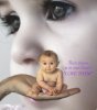
first ever entry , loving this medium nothing to clean up lol
actually im not sure on if i spelt "their" right , bloody english language been using it a long time and still i wonder lol
Nice work ego...
Some shadowing under the baby may have helped this piece.
Good stuff though.
ibclare
Queen Bee
- Messages
- 9,890
- Likes
- 4,028
That is beautiful egosbar. My only comments are that the colors of all the subjects are different. That is fine and probably your intention. Actually, my only criticism is that the hand doesn't have quite the intensity of the baby, just slightly. And I agree with Inkz, a little subtle shadowing would help. But that is just my opinion. Overall, it's a very sensitive and lovely image!
MikeMc
McGuru
- Messages
- 1,847
- Likes
- 1,170
WOW that blew me away.....I think the three skin tones holds this together!! 
What is driving me nutz are the babys toes....A smudge or no red in the toes, and remove the white fringe when you add that shadow
Now I know I have no chances....still gonna finish!
What is driving me nutz are the babys toes....A smudge or no red in the toes, and remove the white fringe when you add that shadow
Now I know I have no chances....still gonna finish!
Last edited:
thanks all for your comments , got a bit impatient to put it up lol , after less then a month and my first challenge i should of spent a bit more time and really perfected it , my question now is am i allowed to spend the time left finalising it and then submit or is this once on thats the end lol , id love to repost it when i finalise it and still be eligable to pick up a couple of votes ,the idea came pretty quick and im sure with more practice i will much better jobs before posting , i was an impatient amatuer artist and the same shows here lol ,
whatever the outcome ill be really working on finalising my work , again thanks for the encouragement its "encouraging" lol
oh by the way the three separate skin tones was definitely on purpose i did want to give each layer its own identity and the way i look at it is that it does exactly what was intended , i just need to do some of the suggestions above and it should be sweet.
Last edited:
- Messages
- 24,260
- Likes
- 13,720
Hey ego,
I really like your concept. Although it's meaning and sentiment travels a different and ironic path for me, but enough of that!
The Baby in the hand is perfect, it meshes well with your message. While others may totally disagree with me, I find the larger Baby in the bg very distracting and I don't know why. It may be competing with the primary image for attention. I wonder if it would look better if it were out of focus? I don't know. If it comes to me, I'll let you know.
Hey ego,
I really like your concept. Although it's meaning and sentiment travels a different and ironic path for me, but enough of that!
The Baby in the hand is perfect, it meshes well with your message. While others may totally disagree with me, I find the larger Baby in the bg very distracting and I don't know why. It may be competing with the primary image for attention. I wonder if it would look better if it were out of focus? I don't know. If it comes to me, I'll let you know.
i did muck around with the opacity of the larger child for that very reason, but i thought there was still a story in the larger child and it was a little lost i thought when transparent , although the main message is definitely revolved around the palm and the baby in the palm with absolutely no thoughts or understanding of a future ,the other thought is of another child looking and beginning to understand there is a future and also beginning to understand the reliance it needs on a loving parent , at least that was my thought process behind the picture . as with any form of art there can be many meanings to many people.
ive modified the image a little now , tried a shadow although i only used the burn tool and also fixed the red foot and a little color adjusments
ahh loaded it and had it ok but made a few adjustments to the hand and now the foot doesnt look right lol too tired now ill get it right before the 31st haha
ahh loaded it and had it ok but made a few adjustments to the hand and now the foot doesnt look right lol too tired now ill get it right before the 31st haha
Last edited:
ibclare
Queen Bee
- Messages
- 9,890
- Likes
- 4,028
Thanks for your explanation egosbar. I think it was well thought out. One thing to consider might be to tone down the background child and place a slight surface or gaussian blur on it. It does, on second look, dominate the image overall. I don't think it would lose its significance if it were softer and less dominant. Just a thought.
- Status
- Not open for further replies.