What's new
Photoshop Gurus Forum

Welcome to Photoshop Gurus forum. Register a free account today to become a member! It's completely free. Once signed in, you'll enjoy an ad-free experience and be able to participate on this site by adding your own topics and posts, as well as connect with other members through your own private inbox!

Paid Help altering Orioles Logo $40


Status
Not open for further replies.

Voss13

Member
Messages
11
Likes
0
Price
40
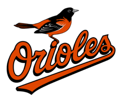
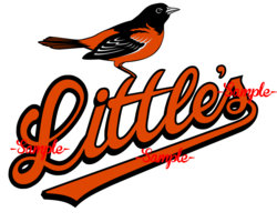
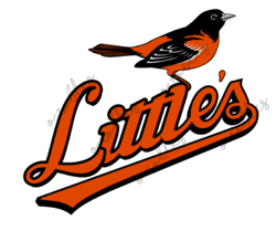
First time using this site and looking for some assistance altering the Orioles logo to say "Little's" instead of "Orioles". Obviously the last 3 letters wouldn't need to be changed at all, but an appropriate looking apostrophe would need to be added. I'd like the bird to be mounted on top of the first "t" to stay in the same proportion as it currently is in the logo. Creating an appropriate looking "L" and a couple of "t's" are obviously my biggest struggle. Would gladly PayPal someone with a quality design $40. Many thanks!
 

Attachments

  • baltimore-orioles-logo-transparent.png
    baltimore-orioles-logo-transparent.png
    403.9 KB · Views: 6
Hi,
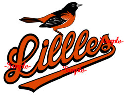
Please check this work and let me know if you require any changes. Currently, I am working on the line through the two T's.1347-After-baltimore-orioles-logo-transparent.jpg
 
This is a tricky bit, because the line hits the dot on the 'i' and the 'l' towards its two ends. Let me know if you have a solution that satisfies you.
 
Thanks for the quick response! This looks really good! I’m thinking by making the tops of the “t’s” mimic the “i” so without the loop it might make room for the line through the “t’s”? I’m also wondering if the top loop of the “L” should intersect with itself a little higher or maybe just decrease the opening in that letter? The hollow part of the “L” just looks a little big especially when compared to the lower case “l” and the “e”. It also just needs an apatrophe between the “e” and “s”. Thanks again!!
 
...by making the tops of the “t’s” mimic the “i” so without the loop it might make room for the line through the “t’s”? I’m also wondering if the top loop of the “L” should intersect with itself a little higher or maybe just decrease the opening in that letter? The hollow part of the “L” just looks a little big especially when compared to the lower case “l” and the “e”. It also just needs an apatrophe between the “e” and “s”. Thanks again!!
By this, do you mean that the dot on the "i" be removed, thus giving space for the line through T's? And, you want the line through T's to go over the "L"?

Let me know if you want the apostrophe smaller.
1347-After3-baltimore-orioles-logo-transparent.jpg
 
No, I like the “i” as is. I just meant perhaps the “t’s” shouldn’t have that loop at the top (instead more like the “i” is below the dot). I’d prefer the line through the “t’s” not be a separate distinguishable item like that. I actually really like what you did with it, but it doesn’t fit the classic logo since the rest of the word is one solid cursive font. I like the size of the apostrophe, but could it be slanted a little more clockwise? Thanks!
 
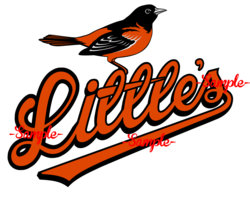
The line through the T's does not do the loop through the T and the line is a solid block going through as if it is cast together. Apostrophe is turned a little clockwise. Did I understand you correctly?
1347-After4-baltimore-orioles-logo-transparent.jpg
 
Sorry, I’m not explaining myself well. I’m saying that I don’t think the apex of the “t’s” need the loop; just envision a printed lower case “t”. I’m not sure the “t’s” should be that identical to the lower case “l”.
 
So, you wanted the loop on top of T's be removed like this? The following is a rough copy to understand the instructions.
1347-After5-baltimore-orioles-logo-transparent.jpg
 
Exactly. I know that’s a rough version, but I think if the spacing is even between the letters and the tops of the “t’s” are fixed, that will work great!
 
I think what you did there looks good. If I can make one more request, can you make it so the black border around the L isn’t equal all the way around? It’s thicker at the bottom for all of the other letters.
 
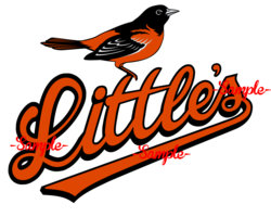
The bird's foot are more firmly placed in this one. Bottom of the L has a thicker outline to match the rest.
1347-After9-baltimore-orioles-logo-transparent.jpg
 
I took a stab at it too... but I like Polarwoc's better, it has that old school feel to it that would fit perfectly on a shirt. Great Job @polarwoc logo.png
 
Last edited:
You both did killer jobs! I’m definitely going to buy @polarwoc because of all the back and forth and i love the classic design, but I might just have to buy both of your designs. I’m curious if either of you have a clean simple way to say “Bachelor Party 2018” at the bottom of your logos? It wouldn’t need to work into the design. Maybe just simple oranges block text with a black border?
 
Status
Not open for further replies.

Back
Top