Hey guys and gals.
i'm designing this thingie for my girlfriend. shes the editor of her colleges student union magazine. they needed a design for a promotion counter that they will use on the first day of school this year to attract new students to write for it.
long story short, this is what i made:
I started with this shady reporter guy. i needed him simplified, this is what i got:
(I ripped the original off of google, i know i shouldn't, sorry guy who made this photo.)
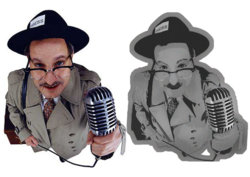
then i created a background and some text (the text in Hebrew says we need you!):

got the sides done as well:

and heres a simulation of how it will look:
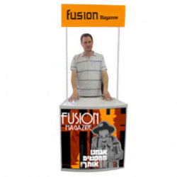
i dont like the background. any ideas on how to improve this? i made the original files HUGE, the psd weighs 1.55gb
what do i do to make it printable?
crits are very welcome!
i'm designing this thingie for my girlfriend. shes the editor of her colleges student union magazine. they needed a design for a promotion counter that they will use on the first day of school this year to attract new students to write for it.
long story short, this is what i made:
I started with this shady reporter guy. i needed him simplified, this is what i got:
(I ripped the original off of google, i know i shouldn't, sorry guy who made this photo.)

then i created a background and some text (the text in Hebrew says we need you!):

got the sides done as well:

and heres a simulation of how it will look:

i dont like the background. any ideas on how to improve this? i made the original files HUGE, the psd weighs 1.55gb

what do i do to make it printable?
crits are very welcome!

