What's new
Photoshop Gurus Forum

Welcome to Photoshop Gurus forum. Register a free account today to become a member! It's completely free. Once signed in, you'll enjoy an ad-free experience and be able to participate on this site by adding your own topics and posts, as well as connect with other members through your own private inbox!


giovyledzep

New Member
Messages
3
Likes
0
Hello!
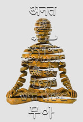
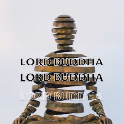
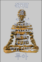
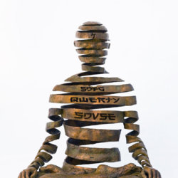
I'm making an image to print and hang in my house. My project is only composed of the image plus the texts on top. I need help finding an elegant solution to make the text stand out from the background image. I've tried the usual things like drop shadow, strokes etc.. but nothing really look professional enough. I don't have a final result in mind, I just need a creative idea that can give a professional look to the print.

I will attach 2 examples of what I've already tried that didn't work for me.

Any ideas would help!

Thank youNo Self around the world.jpgNo Self around the world 2.jpg

 

IamSam

Administrator
Staff member
Administrator
Messages
22,721
Likes
13,258
Hello and welcome.

Can you please upload the PSD file so we can test some theories/ideas?
 

giovyledzep

New Member
Messages
3
Likes
0
Hello and welcome.

Can you pleas upload the PSD file so we can test some theories/ideas?

Sure, I have added a blank layer on top just to reduce the file size, you can delete it. Thanks!
 

Attachments

  • No Self around the world.psd
    17.9 MB · Views: 5

IamSam

Administrator
Staff member
Administrator
Messages
22,721
Likes
13,258
The problems I see is that you have two sharp images competing for attention. Drop shadows on text implies elevation or height over a surface and is not really used unless it's over a solid background, and lastly, transparent text (outlined) allows more of the competing background to steal more attention.

You need to establish what is going to need to stand out more, the background or the foreground which is text in this case. If you want the text to take center stage and not complete with the background, you should try, making the text a lighter color, removing the drop shadow and making the text a solid color. A darker stroke will always frame text and make it a bit more noticeable. Then adding a slight blur to the background so the statue is not competing with the text.

Screen Shot 2019-06-10 at 9.11.10 AM.png

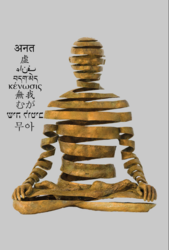
If blurring the statue is not what you want, then you need to place the text into the same plane as the statue and not over it. This way they are not competing and both are visible.
Screen Shot 2019-06-10 at 9.17.36 AM.png
 

JJLAPIN

Guru
Messages
1,064
Likes
1,316
How about Ghosting the background image so that the type will stand out?
No Self around the world_1.jpg
 

Attachments

  • No Self around the world_1.psd.zip
    21.4 MB · Views: 1

Rich54

Guru
Messages
1,733
Likes
3,415
Another option, echoing what IamSam said, is to choose a new color for the text that will make it stand out better. One possibility: sample the gold/bronze color of the statue and, on a new layer, use the brush tool to create a color swatch. Then go to Image>Adjustments>Invert. That will change the color of the swatch to its "opposite" on a color wheel, which in this case is a medium blue that can be used for the text. Opposite colors stand out from each other and also complement each other nicely.
 

giovyledzep

New Member
Messages
3
Likes
0
Thank you very much for all your suggestions! I am trying a few different things, will post the results soon... Thanks!
 

Top