Accurate color reproduction, which is essentially what you are asking for, is a surprisingly difficult topic.
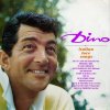
If you go to Google Images and type in {dean martin dino italian love songs album}, you will see a page full of reproductions of this album cover, each of which has slightly different colors. The reason for this is because many of the versions that you see were likely produced by someone who honestly thought that their version had the "best" or "most accurate" color. Obviously, they didn't agree on this.
So, before I would start any work on your request, my first question to you is whether or not you have a calibrated monitor and fully color managed workflow. If you don't have these things, or don't even know what these terms mean, then you should realize that your system is almost certainly misleading you with respect to colors -- maybe a lot, or maybe just a little. But this problem will almost certainly make you select a "goal" example (ie, to show us) that is not what you truly want.
Even more confusing is that even if you own this album, and can actually hold the physical object in your hand and compare it to what you see on your monitor, even with this, you may still select a bad "goal" example because of the lack of calibration of your system.
To make matters even more difficult, there is the issue of aging of the dyes and paper of an old album. This adds the additional question of whether you want your (color) goal to be how the album cover looked when it was first released or how it looks now, after it has aged for 40 or more years. Also, there is the additional question of whether the colors on the freshly printed album cover were as good as what can be done now.
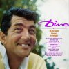
With the above issues in mind, until we hear back from you on whether you have a recently calibrated high quality monitor, what I have done is my purely subjective color correction: I have tried to make the image look as good as possible to me on my color calibrated and managed system. This means that it almost certainly doesn't look like your goal image looks on your system, but if send this version (or Ged's) to a good printer or if it was viewed by anyone with a color calibrated system, the colors will likely look reasonable, subjective differences not withstanding.
Hope you like it.
Tom M
PS - All of the above can be summarized by saying that basically, I don't believe that your goal image was the best choice ... unless you have a system that has been fully and independently calibrated with a separate hardware device, and for some reason, unknown to us, that is indeed exactly what you want.