Generally, a Vector program would be a better choice for this type of effect -- i.e. Illustrator, XaraX, Corel Draw, etc.
But it's fairly simple to do, especially once you understand what's happening to create the effect. So I've created a version that will work with Photoshop. Have a look at the example image shown here. That should explain pretty-much everything needed; but I'll run through the actual steps here for you too.
Note the effect below was not created to look "perfect", but instead, kind of hand sketched. This is done by making some of the cross-section lines a little crooked or a little short.
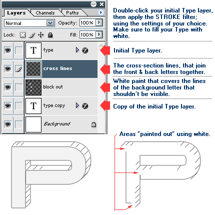
Create your initial Type layer. Fill it with white.
Open the "Layer Effects" (double-click the layer) and apply the Stroke filter (it's on the bottom of the list). NOTE: your stroke color should be a medium gray (pencil lead color) for a good effect. But it can be whatever you want.
Duplicate the Type layer, and use the arrow keys to move this layer UP and to the RIGHT. How far it needs to be moved depend on the size and style of the font used. But try moving it 10 pixels up & right; just as a starting point. You can adjust it from there if need be.
Create a New Layer, and move it in between the 2 type layers. Set your Foreground color to the same color you stroked your type with (it can also be a bit lighter if you want). Use the Line tool -- set it to 1 pixel, with Anti-Aliasing ON. Draw the cross-lines mainly at the areas where the type curves (see example image). They represent shading on the type. You can make these lines as dense or as sparse as you like. That's your call.
And finally, switch to white and grab a small brush. Then create a New Layer and put it just below the "cross-section lines" layer; from step 4 (see sample image). Paint over the parts of the stroke lines from the background letter, that shouldn't be visible. These will usually be the lines seen on the inner corners of the letter (see example image).
T I P S
- One thing I did to give the type a bit more "depth", was to refill the top Type layer with a very light gray. That's optional of course.
- One thing to note with this effect is that not every letter you may use will have curves to it -- like a capital letter A. In that case, the cross-section lines can be applied to the straight side edges of the letter. This effect though does in fact lend itself better to curvy letters.
Have fun!
Copyright © Mark Anthony Larmand
For help, advice, tips and tricks, challenges, feel free to visit our