


Photoshop Tutorials
Chrome Text
Note: We all know that there are a million-and-one chrome & metal effect tutorials out there, but the things we'll be covering here can be applied to all reflective surface effects. That includes such materials as stainless Steel, Glass, Plastic, Mercury, Polished Marble, Glazed Wood and anything else you can think of actually. They're all covered here with respect to their reflective natures.
Before you dive into this stuff, if you'd like to read a bit about what makes reflection behave the way it does, here's a brief page on that. If not, go ahead and continue on.
| Step 1 |
SIZE: 250w x 75h pixels
MODE: RGB
BACKGROUND: White
RESOLUTION: 72
We need to create some text.
Make your foreground color Black.
Use the Type tool and type in some text. Use one word for now to keep it simple. Also, use a fairly 'fat' font. Impact is a good one, if you have it.
After your text is on the new layer, grab the Move tool and roughly center it if it's not already.
Name this layer 'Black'.
Now we have to 'Render'(PS5.5) or 'Rasterize'(PS6+) our type layer before continuing.
Rendering/Rasterizing a Type layer:
PS5+: Right-click(PC) (Mac: long-click) on the large 'T' by the layer name, and choose 'Render/Rasterize' from the pop-out menu.
PS6+: You don't have to click the 'T' icon to do this. Click anywhere else on the layer in the palette.
Now we need to make our text 1 pixel 'fatter' so that it will have a slight '3D' thickness to it. The easiest way by far to increase the overall size of our text is to open the Filter Menu, and go down to the submenu 'Other'. From within that section, choose 'Minimum'. Set the slider to 1. That will add 1 pixel to the overall size of our text object.
T I P using 'Maximum' will shrink our text object by a selected amount of pixels. Think about that for a second, and I'm sure you realize just how useful these two filters can be.
| Step 2 |
Now 'Lock' the transparency for this duplicate layer, to protect the transparent areas.
(I always do this instead of 'selecting' the layer transparency. It's much faster and less confusing to explain too)
Select the Gradient tool and set the Foreground color to White and the background color to Black.
Use these settings for the tool:
MODE: Normal
OPACITY: 100%
GRADIENT: Foreground to Background
TYPE: Linear
Now start from the top of your text and drag the tool to the bottom of it, and let go (hold down Shift to make the gradient perfectly straight). This should give you a simple white to black grad from top to bottom.
Set the blend mode of this layer to DIFFERENCE. But if you notice any ugly thin black lines around your type, then use EXCLUSION instead.
| Step 3 |
Name these new layers "Grad 2" & "Grad 3" respectively. Now we want to make these two layers 'thinner'; in essence, returning the text back to its original size or thickness. Before doing this, unlock the layer transparency for each layer. Now activate the 'Grad 2' layer, open the Filter menu and go down to the 'Other' section again. This time however, choose 'Maximum', instead of 'Minimum'. Set the slider to 1 pixel. Click OK to apply the filter. Now activate the 'Grad 3' layer, and apply the Maximum filter also. But for this layer set it to 2 pixels. This will give our object some 3D thickness, further enhancing the look of the effect.
And finally, click on the 'Grad 2' layer to activate it, then hit Ctrl + I to invert the gradient; effectively turning the gradient upside down.


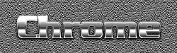
Here is what the basic "simple reflection" should look like. See those single dark and light lines running across the text? The 'trick' to enhancing the look is in the duplicate layers being the opposite shades of gray from the layer just below it. The more duplicate and inverted layers are added, the more complex the look of the effect becomes -- within reason of course. Like in the examples below...


T I P
The effect seen above was done by duplicating the 'Grad 3' layer 2x. Inverting the first duplicate and setting the 2nd one to Color Dodge blend mode. Doesn't the effect look nice? You can sort-of 'feel' the weight of the metal, just from the way it looks. ;) And the cool thing is... once your text is created, the effect takes less than one minute to produce. Who needs a plug-in?!
If you want to 'roughen up' the look just a bit, the quickest way would be to shrink the 2 duplicate 'grad 3' layers that were mentioned in the above step. After applying the changes mentioned, click on the first duplicate layer, then open the 'FILTER/Other/Maximum' filter. Set it to 1. Then click the second duplicate and do the same to it, but set the filter to 2. This will roughen up the inner area a bit. Give it a bit of a gritty, grungy look. Blurring the 1st duplicate layer a small amount looks good too. You can always UNDO it if you don't like it.
| Step 4 |
Ok turn off the Grad 2 & Grad 3 layers, and then turn them on one at a time starting with the Grad 2 layer. Take notice of how the gradient changes in the text with the addition of this second gradient layer. Because the layer is also set to Difference mode, and its gradient is opposite to the one on the layer below, the combination of the two gradients causes the dark part of the gradient to shift upward from the bottom of the text, towards the middle of the text object.
An extra effect is the slight bowing effect on the text. The text object looks like it is becoming a bit rounded on its face surface. Do you see it?
What is actually happening is that Difference mode flips the gradient upside down (difference = inversion). While at the same time letting the gradient on the layer below to show through to a varying degree. Combining gradients in this fashion, using the Difference blend mode, is what produces the overall effect.
Now turn on the Grad 3 layer and watch what happens to the gradient then. Notice how the dark part of the gradient is now being shifted back down towards the bottom again. And notice how the dark band in the gradient is becoming thinner too.
This procedure is causing the gradient to become a bit more complex. Notice now that the "bowing" or "rounded" effect is no longer there? That is because we've inverted the gradient again and "flattened" it out. By adding another layer you would produce the "rounded" effect again.
You can do this infinitely by stacking more duplicates of these layers on top of each other. The effect is that the gradient will become increasingly more complex.
| Step 5 |
Most times, this effect can stand on it's own merit, as-is. But there are times when you'd like to spice up the look in some way, either to match a certain design need, or just for a change.
Adding color is simple. Select your main text/object, and at the top of the layers palette add a HUE&SAT Adjustment layer. Best results are produced by lowering the Saturation to 10-20%. Then just dial in your desired color In the example below, I also lowered the brightness 5-10% so that I got an aged, brassy look.
As well, photos of rooms or scenery can be used to create more specific types of object reflections in the effect. My example had the photo's blend mode set to Overlay, and the Opacity at 50%. Experiment with these settings, as there are a lot of variations to be had.


Hope you enjoyed this one!
Copyright © Mark Anthony Larmand
For help, advice, tips and tricks, challenges, feel free to visit our