


Photoshop Tutorials
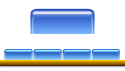
Plastic Menu Buttons
 Preparations:
Create a New Document. The dimensions will be dependant on what size you want to make your buttons; but they can always be sized down later. If you're not sure, just make it 400x200 pixels @ 72dpi, and RGB with a White background. The large button shown in the example images above is 90x35 pixels.
We're going to give our transparent plastic buttons some color here. I think it creates a better effect than just using plain white (ala the 'iMac' Web site). At the end of this tutorial though, I'll explain some variations you can get; including fully transparent.
| Step 1 - The button shape |
Apply a 4 pixel Gaussian Blur to the channel.
Open the Levels filter (Ctrl+L). For the Input levels (top half of the editing window), drag both the black and white slider adjustment arrows toward the center arrow.
 The center adjustment arrow should always remain at 1.00. To start with, try using these settings for the black and white sliders: move the black arrow to 109 and move the white arrow to 134; or you can just type the numbers in manually. (What we're doing is resharpening the edges of our channel shape, while making the corners smooth and round.)
Ctrl-Click this channel and return to the 'button' layer in the Layers palette.
Fill the selection with black. Now return to the channels palette and Ctrl-Click the 'original shape' channel. Return to the 'button' layer again.
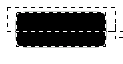 Using the Rectangle selection tool, hold the Alt (MAC: Option) key down and loosely select the top half of the currently selected area. This will Deselect that portion leaving us with just the bottom half, which has the sharper corners on it.
Now fill the remaining selection with black, and press Ctrl+D to Deselect. We should now have our button shape; rounded top corners and square bottom corners.
 |
 |
| PS6 | PS7 |
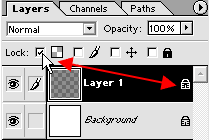
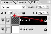
On your 'button' layer, 'Lock' the "Layer Transparency". Now fill the shape with a Linear gradient, from top to bottom. When choosing the start and end colors you want, make sure the darker color is applied to the TOP of the shape (so it should be your Foreground color); the bottom should be lighter (so it should be your Background color). Leave the layer's Blend Mode on Normal.
T I P: for better looking results, choose 2 colors that are in the same 'tonal' family. However, the final colors can be changed later if you like, using the Hue and Saturation filter. What's most important is that your gradient go from dark to light, top to bottom.
| Step 2 |
Now apply a Motion Blur to the layer with these settings: Angle=90/Distance=5.
Deselect now, and pick the Move tool. Use the down arrow key and nudge this layer down 3 times (3 pixels).
Because we've moved this layer down, part of it will be sitting below the bottom of the button; but it's white, so we can't see it against the white background. Ctrl-Click the 'button' layer to load its selection, then press Ctrl+Shift+I to invert the selection. Make sure the 'edge highlights' layer is active, then press the Delete key.
Finally, set the Blend Mode to Soft Light.
| Step 3 |
Hit Ctrl+H to hide the selection. Grab a small, soft-edged round Airbrush and paint a stroke along the top of the button. Your selection will protect the canvas, so start the paint stroke outside the left top edge, and finish it outside the right top edge. Hold the Shift key down while you paint the stroke, and you'll get a perfectly straight line.
This ensures a balanced, smooth looking stroke. For the best effect, don't paint the highlight along the very top of the button. Instead, paint it just a bit below the top edge. Then Deselect. If the stroke looks too close to the top when you're done, just use the Move tool and down arrow key to nudge it down 1 or 2 pixels. Trust your eyes to know when it looks right.
Note: Brush size will vary depending on the size/shape of your button(s). For the shape and size of the buttons I made (see example pciture at top), my brush size was 5 pixels, with a soft edge.
Now to complete the look, let's remove the corners of that highlight line. It ruins the effect. Grab your Eraser tool, and using a medium sized soft brush (the brush should be bigger than the thickness of the highlight), erase just the left and right ends of the highlight line; the parts that cover the rounded corners of the button (see example picture at top). Basically, we don't want the top highlight creeping down the sides of the button.
VARIATIONS
A solid, colored button: Leave the 'button' layer on Normal mode.
A transparent, colored button: Turn the 'button' layer's Opacity down to 60%. When you put in a background image or tile pattern, you'll see how this makes the button appear transparent. For now though, just continue on with creating the button.
A solid, colorless button: If you really want a colorless button, just set the 'button' layer's Blend Mode to Luminosity, instead of Normal. Or, you can simply Desaturate the 'button' layer after you create it, and leave it on Normal mode.
A transparent, colorless button: Set the 'button' layer's Blend Mode to Luminosity, instead of Normal. Or, you can simply Desaturate the 'button' layer after you create it, and leave it on Normal mode. Then turn the layer's Opacity setting down to 60%. If you wish to, you can also lighten up this button quite a bit using the 'Levels' filter. Just open it, and move the middle slider (gray tones) way over to the left, toward the black slider.
There, we're done! Just add your text to the button and it's complete. Give the text a VERY light shadow, and make the shadow sit about 2-3 pixels straight below the text. If you want the text to look like it's embedded inside the button, just reduce your text layer's Opacity to 70 or 80%. But if you do this, you'll have to pick a slightly darker color for the text's shadow.
Now, if you want to, you can create some kind of bar or mounting to run along underneath, or to incase the buttons in. Just something for them to look like they're sitting on or in. I'll leave that part to your own imaginations.
T I P S
- To create a darker more rich color on your buttons, just Duplicate your 'button' layer. Then set the duplicate's Blend Mode to Multiply, and turn the Opacity setting down to 50%.
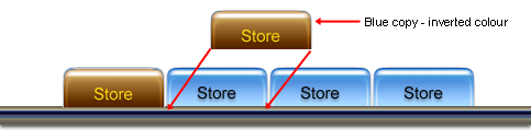
- Another variation involves the use of Javascript image rollOvers. If you intend on using those, then have a look at this example image. It shows you briefly one idea you can do to create the 'MouseOver' version of a button.
Hope you liked this one!
Have fun with it!
Copyright © Mark Anthony Larmand<
For help, advice, tips and tricks, challenges, feel free to visit our