


Photoshop Tutorials
Stroked Text and Other Effects

| Step 1 |
Attributes: 300x150 pixels / RGB / White Background.
| Step 2 |
Photoshop 5+ users: The same rules apply here for stroking type as they do for Filling it. You must Render your type layer first in order to apply any kind of effect directly to the layer, other than a basic color fill. (not counting PS 5.5's built-in Layer Effects)
| Step 3 |
Switch your Foreground color to be a color you'd like to use for the outline.
Open the Edit menu and choose Stroke from the list.
T I P: It isn't absolutely necessary that we create a new layer for this type of effect, but we're applying the concept of "non-destructive" editing here. And that's always a good thing to do for maximum creative flexibility. So in other words, we're not destroying our original text layer while applying an effect to it.
- Select the options you wish to apply for the stroke:
Width = the thickness of the stroke outline, measured in pixels.
Location = Inside the selection border / In the Center of the selection border / Outside the selection border.
Blending = Opacity of the stroke (works the same as for the Layers palette) / Mode as in 'Blend Mode' (same as Layers palette) / Preserve Transparency if ticked ON, will not apply the stroke to transparent areas of the layer.
Once you've selected your options, click OK to apply.
T I P S
- Stroke Clear:
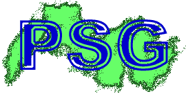 When you have the Stroke dialog box opened, take a look in the 'Blend Mode' drop down list. You'll notice that there is an extra option to choose from that isn't in the normal Mode list for the layers palette. This option is called Clear. What this option will do is apply a stroke that erases pixels from the layer, instead of adding pixels. Like the inside area of the letters in this sample image show. Try it! It has some interesting potential for certain types of effects.
- Stroke Dissolve:
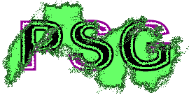 Another 'special' option we can apply as a stroke is the Dissolve option. If you use this mode for your normal layer's blend mode, you'll see that it is quite limiting in its usefulness. Once set, you cannot apply any other types of blend modes to the same layer, thus robbing us of certain types of effects. But, by using the Dissolve Blend Mode option in the Stroke command, we can then ALSO apply another blend mode from the layer's normal blend modes list.
As you can see in the sample image here, I've applied the same Stroke settings as in the above sample, except this time I used the Dissolve option instead of Clear. This produced a frazzled-edges effect inside the text area; I also applied a Dissolved stroke to the green shape behind the text. I then was free to apply another blend mode to the text 'layer' as well. I used Difference Mode here.
NOTE: Using the Dissolve blend mode from the Stroke command is a 'destructive' function. i.e. will destroy the original text if not applied to a new blank layer.
Where as using the Dissolve blend mode from the layer palette's list is a 'non-destructive' function; which can be safely applied to the original text layer. And can be removed at any time, by simply choosing a different blend mode from the list
- Stroke Behind:
 Because I am not a fan of 'destructive editing', I have not found this particular option for stroking to be of much use. It's kind of tricky to explain how this option works, but I'll try and explain it here for you anyway. (Experienced users may understand this more easily)
Basically it works just like the name implies - your stroke will only be applied behind whatever pixels are found within your selection bounds. In technical terms it works just the same as if you were to create a selection area by 'intersecting' 2 selections. When the stroke is applied, Photoshop looks at the layer's content, and sees where there are pixels already on the layer, then it applies the stroke to any 'transparent' areas found within the current selection minus the pixels that are already there. Study the sample image here to see the effect produced.
You'll quickly notice that basically it looks like I've added a simple drop shadow layer to my text. But the difference here lies in the fact that the stroke has been applied to the same layer as my text was on - making it a 'destructive' technique.
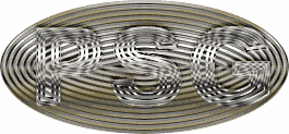
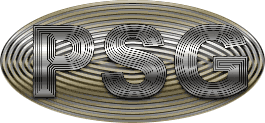
Guru Puzzle!
Here it is:
Using the above stroking techniques and tips, see if you can reproduce the effect seen in these 2 example images. I realize that this may be a tough thing to do exactly, by just looking at the images. But the idea is NOT to completely replicate these images. The REAL idea here is to get your imagination going by challenging you to reproduce them. So with that in mind, here's a few hints at what went into creating these 2 effects:
- To create the shiny reflection effect in the images, I applied a multi-colored gradient to a Duplicate of my text layer. So, no stroking involved with this part of the effect.
- To create the gray metallic effect in the 2nd image (on the right), I filled a Duplicate of my text layer with a medium gray. So, no stroking for that part of the image either.
- The color for the 'buckle', if you will, was done by creating the oval shape and applying another multi-colored gradient as a fill. BUT, that doesn't include the ridges seen in the oval shape here. Those were created using the stroking methods explained above.
- And finally, the only difference between these two text effects is one extra layer. That's all. So, not a lot of extra work involved there huh?
Have fun!
Copyright © Mark Anthony Larmand
For help, advice, tips and tricks, challenges, feel free to visit our