


Photoshop Tutorials
Classy Glass Buttons
PAGE 1 / 2
| Step 9 |
And you're now done the basic button. You can either stop here, or continue on.
As it stands, the button is pretty much complete.
It looks good and is fully functional. But there's still a bit of room to further the look of the effect, if you don't mind a few more simple steps.
| Step 10 - Reflections |
NOTE: Your photo should not be real dark. The more light there is in it, the better effect you'll get. That's why photo's of kitchens are used so much for this purpose -- because they have a lot of windows and lights in them.
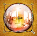 Now pick the MOVE tool and drag the photo into your button document.
Photoshop will put it on it's own new layer, right above your 'texture' layer. Select All, and cut and paste he photo; to center it in the document. Then press Ctrl+Shift+U to Desaturate the photo. Apply the Spherize filter to the layer 2x.
EDIT>Transform>Scale. Scale the photo down so it's just a little bit smaller than the button image. Ctrl-click your 'texture' layer, Feather the selection 3 pixels, then invert the selection and press Delete 5x. Then Deselect. Set this layer to Luminosity mode, and lower the Opacity to 15%. And finally, run the Unsharp Mask filter at 150/0.5/0.
| Step 11 - 3D Shadow |
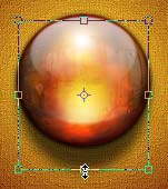 Duplicate the shadow layer you made before. Then apply a 4 pixels Gaussian Blur to the duplicate.
Now use the EDIT>Transform>Scale tool and drag the bottom handle down a fair bit. We want the shadow to look slightly stretched; which will make the button look thicker. Then lower the Opacity to 65%.
This step is quite optional. You may not wish to apply this part to your button. But at least now you know how to, and how it effects the look of the button.
| Step 12 - Specular highlights |
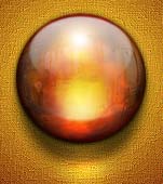 Create a new layer just above the 2nd shadow layer you just made.
Using a 35-50 pixel, soft-edged brush, apply a spot of white below the button, and half-on half-off of the elongated shadow. We want the highlight to brighten both the shadow and the background texture. Set the layer to Overlay blend mode.
| Step 13 - Extra details |
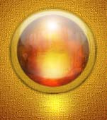 Click on your Background layer. Then Ctrl-click the 'Layer 1' to create a selection. Expand the selection by 10 pixels and press Ctrl+J. This copies that part of the Background image onto it's own layer. Move this layer above the 'texture' layer.
Ctrl-click 'Layer 1' again, and press Delete. Now use the EDIT>Transform>Scale tool and resize this circle to match the size of the button. Ctrl-click 'Layer 1', Feather the selection 2 pixels, invert the selection and press Delete.
Set the layer to Hard Light mode and lower the Opacity to 25%.
( example here shows layer before blend mode is changed. )
If any of this has confused you at all, I suggest redoing the steps. Once you understand how each layer is working to create the combined illusion, it'll be much easier to recreate the effect any time you want.
 T I P S: To make a finished copy of your button which can be pasted into a different document, do this:
Ctrl-click the shadow layer ( with or without the elongated shadow ), and turn off the background layer. Then under the EDIT menu choose 'Copy Merged' ( Ctrl+Shift+C ). Then either paste into a different document, or into the current one. Either way, Photoshop will automatically create a new layer for the pasted button.
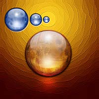
Try to create a button design that will best suit the environment it will be used in. For instance... match up the colors used, and don't be afraid to use multiple button sizes together.
T I P: You may be thinking... "Man I do NOT want to do all this again the next time I need a cool button!" Hey don't worry... neither do i! That's why I've created a large version, and anytime I need another button like this, I just change the color and scale it down to fit my specific need at that time. ( Just like the blue buttons in the above example. ) I will also redo the 'texture' layer step too to make the button look fresh and original. Hey?! A very simple solution!
The really cool thing about creating this effect manually, without a plug-in... is that it will always look very original and you have way more control over the final effect. And plus... you feel much better knowing you created this yourself from start to finish.
Hope everyone enjoyed this one.
Copyright © Mark Anthony Larmand
For help, advice, tips and tricks, challenges, feel free to visit our
PAGE 1 / 2